
About this project
OF: 자연의 리듬을 담은 브랜드
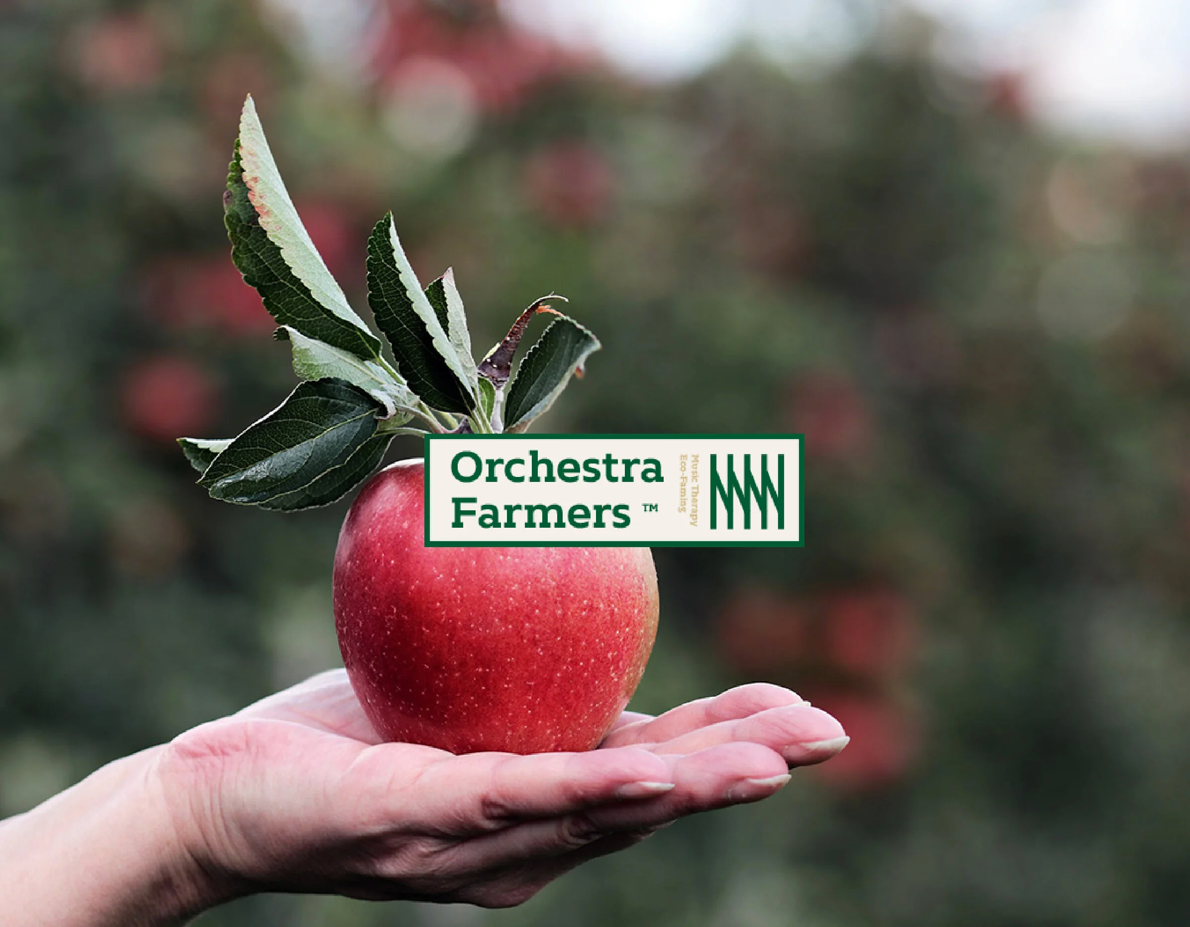
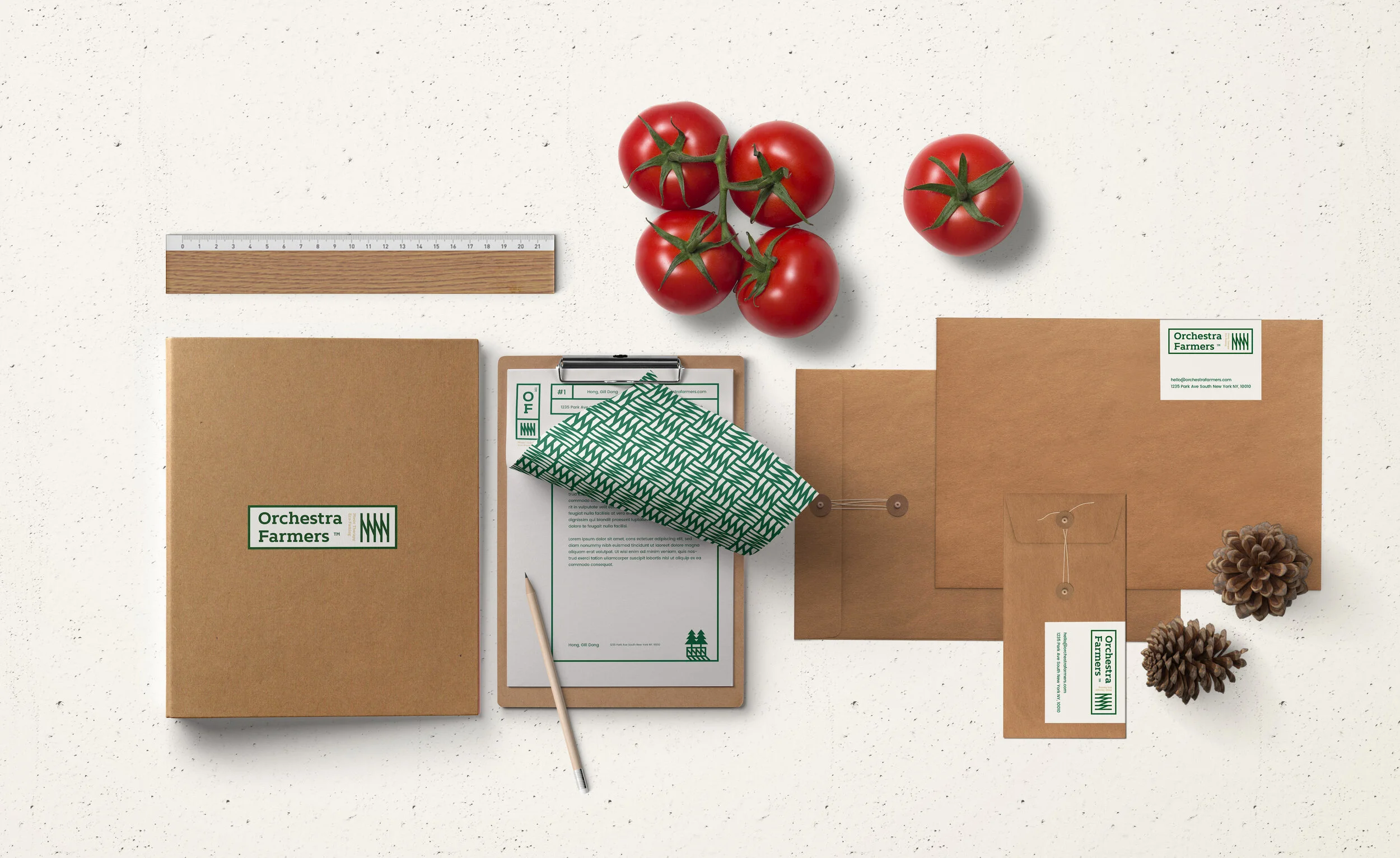
Orchestra Farmers는 신선함과 조화를 가장 소중한 가치로 여기는 농장에서 시작된 브랜드입니다. 이름 ‘Orchestra Farmers’는 농부와 작물, 계절이 함께 어우러져 하나의 오케스트라처럼 생명의 리듬을 만들어내는 농장의 모습을 담고 있습니다.
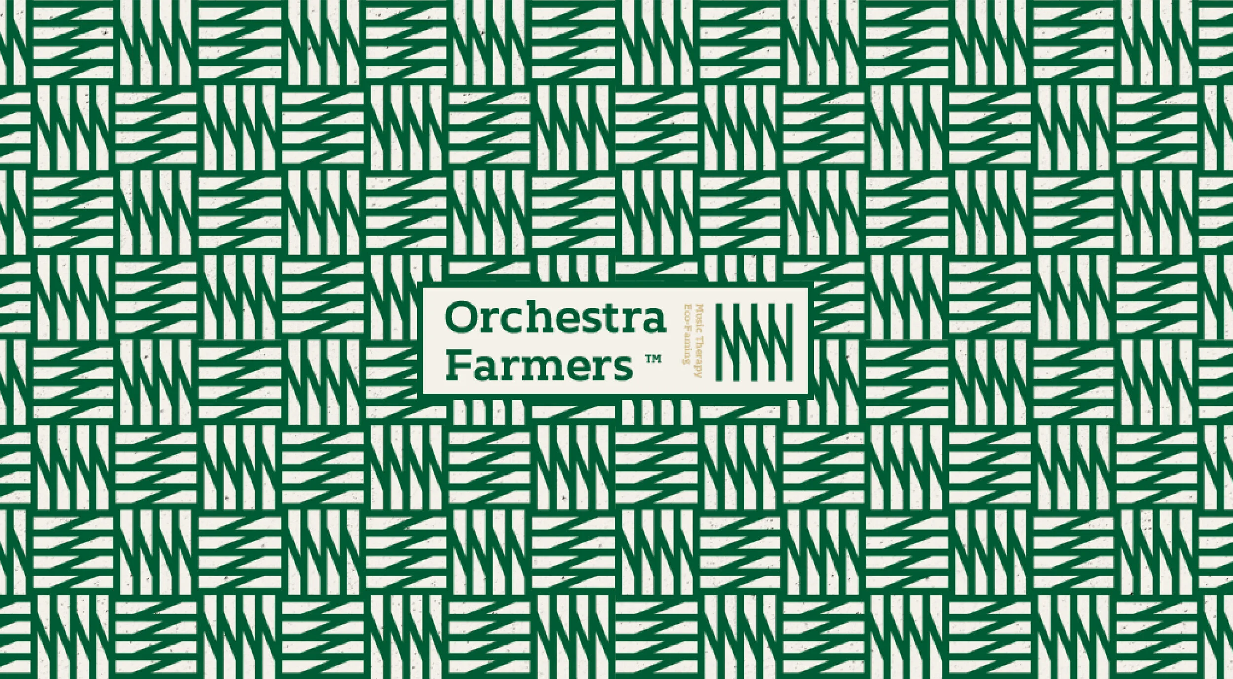
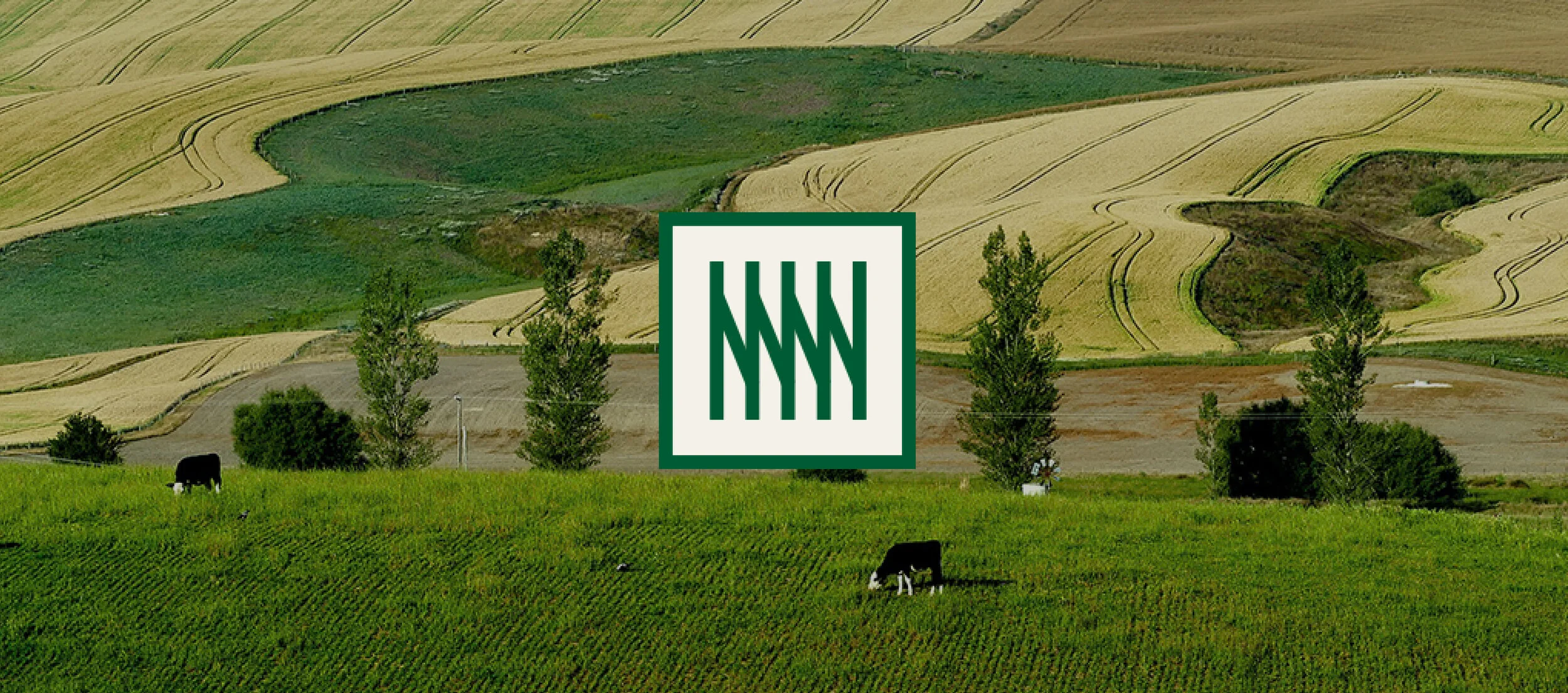
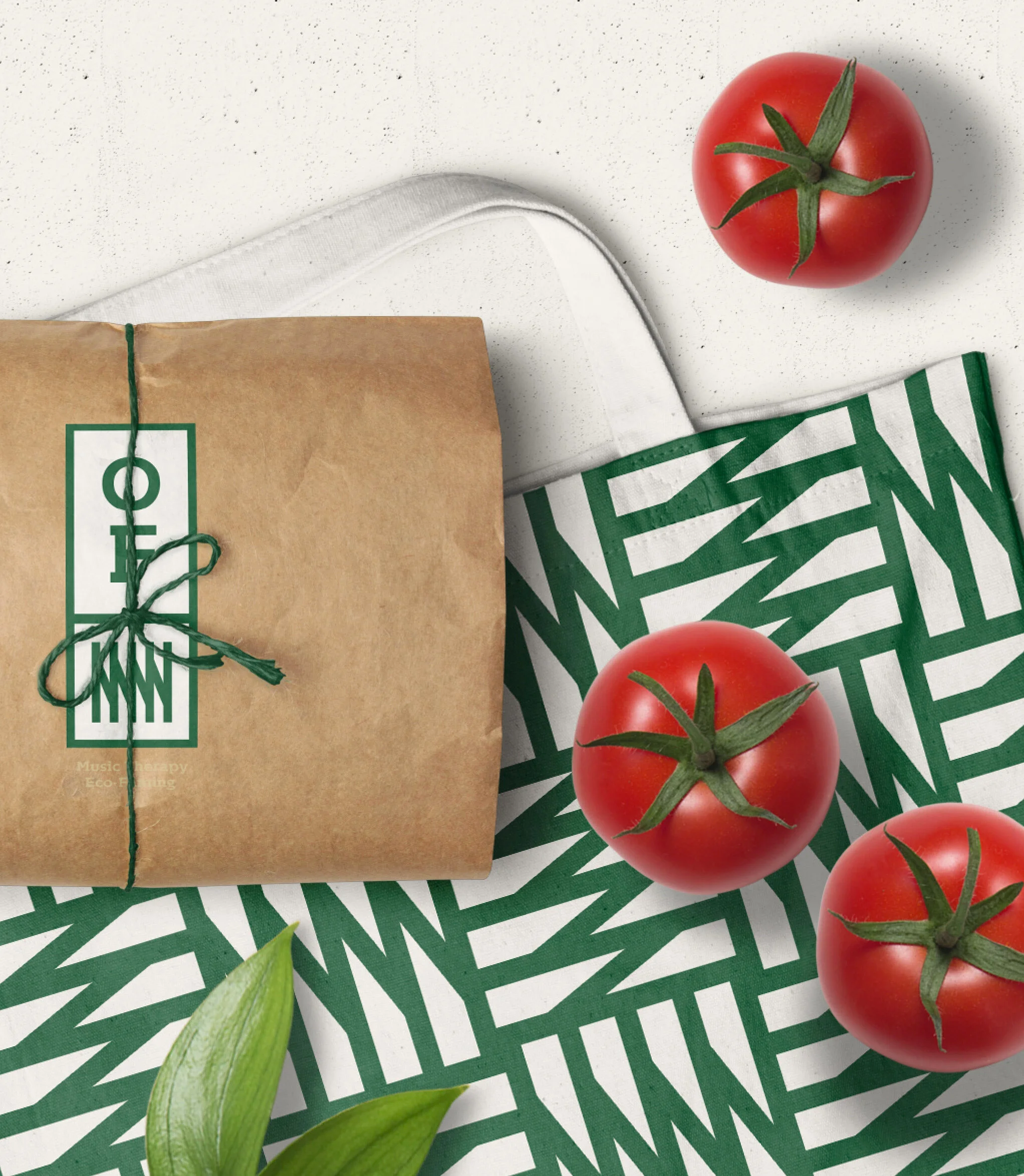
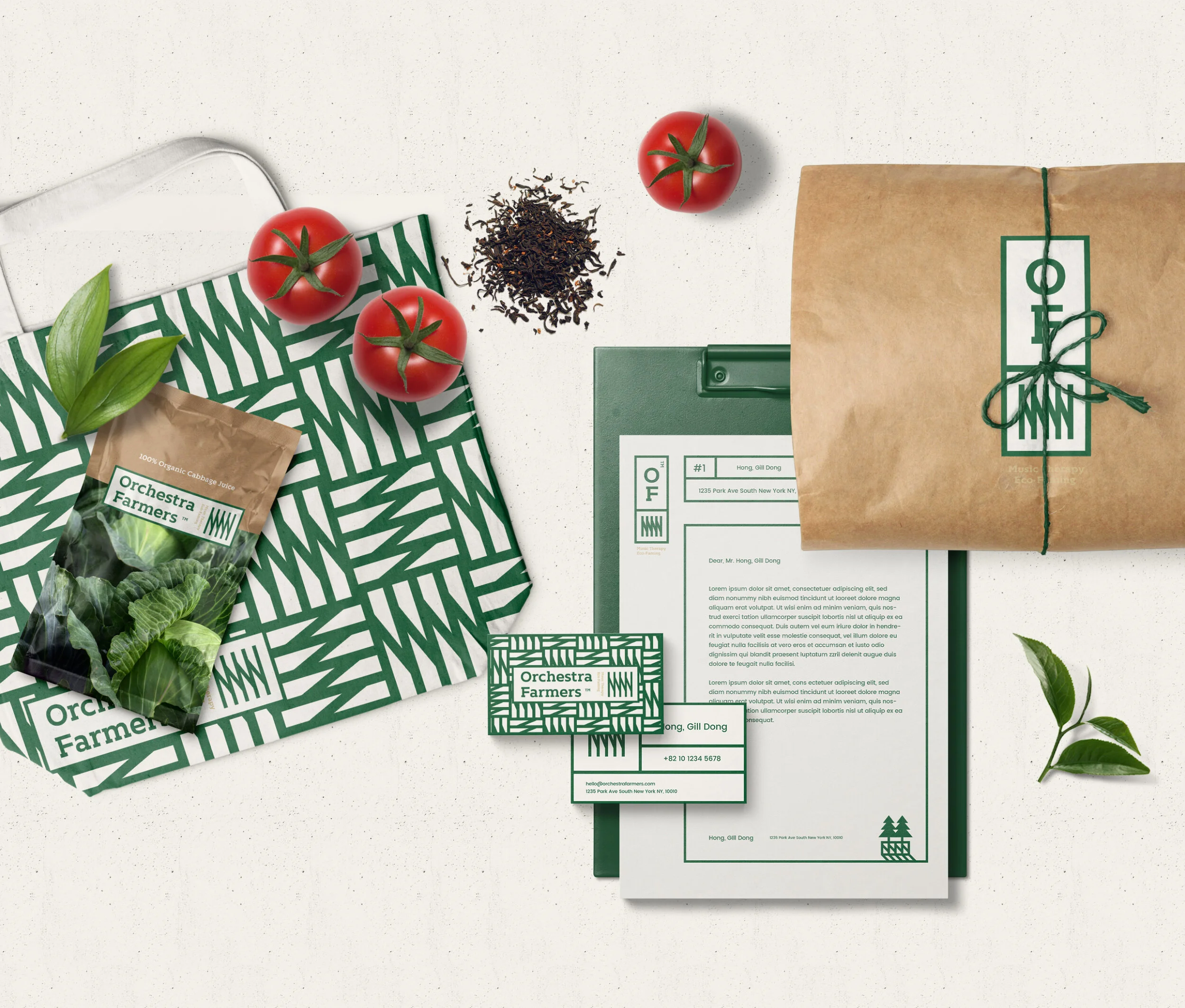
TIN은 이러한 브랜드 철학을 시각적으로 표현하기 위해, 농장의 위에서 내려다본 풍경에서 영감을 받은 심볼을 디자인했습니다.
줄지어 자란 작물의 패턴이 마치 음표나 파동처럼 보이는 형상으로, 자연의 질서와 브랜드 이름 속 음악적 은유를 동시에 담아냈습니다.
짙은 녹색은 풍요와 진정성, 그리고 지속 가능한 농업을 의미하며,
크래프트 브라운 컬러는 흙의 따뜻함을 상징합니다. 로고부터 패턴 시스템까지 모든 디자인 요소는 친환경적 가치와 장인의 손길, 그리고 음악적 조화감을 담아냈습니다.
Orchestra Farmers는 단순히 신선한 농산물을 판매하는 브랜드가 아니라,자연이 들려주는 조화의 아름다움을 함께 나누는 브랜드입니다.
Orchestra Farmers is a brand born from a farm that values freshness and harmony above all. The name reflects the idea that each crop, each season, and each farmer plays a part in a larger orchestra, together creating the rhythm of life that fills the field.
TIN developed the brand’s visual identity to express this organic rhythm. The symbol was inspired by the aerial view of a farm field, where rows of crops form patterns that resemble sound waves or sheet music. This motif visually connects nature’s quiet order with the musical metaphor behind the brand’s name.
A deep green palette symbolizes fertility, sincerity, and sustainable agriculture, while kraft brown tones evoke the warmth of the soil. Every detail, from the logo to the pattern system, was designed to convey eco-friendliness, craftsmanship, and musical balance in the everyday life of a modern farm.
Orchestra Farmers is not just a brand that sells fresh produce, it’s a movement that celebrates the beauty of nature’s harmony.
What we did
브랜드 아이덴티티, 패키지 디자인, 일러스트레이션
Brand Identity, Packaging Design, Illustration
Project Site
↗
프로젝트 상담
↗
About this project
OF: 자연의 리듬을 담은 브랜드
Orchestra Farmers는 신선함과 조화를 가장 소중한 가치로 여기는 농장에서 시작된 브랜드입니다. 이름 ‘Orchestra Farmers’는 농부와 작물, 계절이 함께 어우러져 하나의 오케스트라처럼 생명의 리듬을 만들어내는 농장의 모습을 담고 있습니다.
TIN은 이러한 브랜드 철학을 시각적으로 표현하기 위해, 농장의 위에서 내려다본 풍경에서 영감을 받은 심볼을 디자인했습니다.
줄지어 자란 작물의 패턴이 마치 음표나 파동처럼 보이는 형상으로, 자연의 질서와 브랜드 이름 속 음악적 은유를 동시에 담아냈습니다.
짙은 녹색은 풍요와 진정성, 그리고 지속 가능한 농업을 의미하며,
크래프트 브라운 컬러는 흙의 따뜻함을 상징합니다. 로고부터 패턴 시스템까지 모든 디자인 요소는 친환경적 가치와 장인의 손길, 그리고 음악적 조화감을 담아냈습니다.
Orchestra Farmers는 단순히 신선한 농산물을 판매하는 브랜드가 아니라,자연이 들려주는 조화의 아름다움을 함께 나누는 브랜드입니다.
Orchestra Farmers is a brand born from a farm that values freshness and harmony above all. The name reflects the idea that each crop, each season, and each farmer plays a part in a larger orchestra, together creating the rhythm of life that fills the field.
TIN developed the brand’s visual identity to express this organic rhythm. The symbol was inspired by the aerial view of a farm field, where rows of crops form patterns that resemble sound waves or sheet music. This motif visually connects nature’s quiet order with the musical metaphor behind the brand’s name.
A deep green palette symbolizes fertility, sincerity, and sustainable agriculture, while kraft brown tones evoke the warmth of the soil. Every detail, from the logo to the pattern system, was designed to convey eco-friendliness, craftsmanship, and musical balance in the everyday life of a modern farm.
Orchestra Farmers is not just a brand that sells fresh produce, it’s a movement that celebrates the beauty of nature’s harmony.
What we did
브랜드 아이덴티티, 패키지 디자인, 일러스트레이션
Brand Identity, Packaging Design, Illustration
Project Site
↗
프로젝트 상담
↗