
About this project
Pin Production은 깊이 있는 사고와 창의적 실험정신을 바탕으로 새로운 시각 언어를 탐구하는 프로덕션입니다. Pin은 아이디어의 본질을 분석하고 그 철학을 구조적으로 구현하는 스튜디오입니다. 실험과 대화를 창작의 일부로 받아들이며, 과정과 의미를 중시하는 태도로 일합니다.
TIN은 이러한 철학을 토대로 Pin Production의 새로운 브랜드 아이덴티티를 구축했습니다. 이 프로젝트는 단순한 리뉴얼이 아니라, 브랜드의 사고방식을 시각적으로 구조화한 결과물이었습니다.
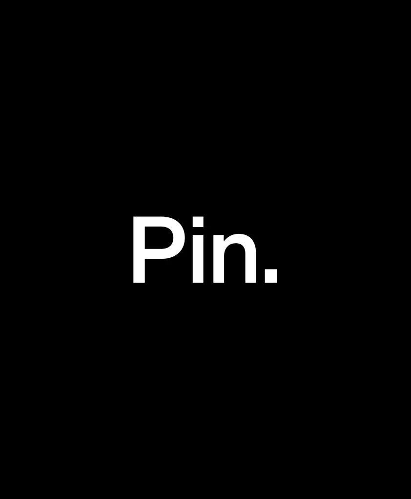
‘Pin’이라는 이름은 Praxinoscope, Circle, Infinity, Continuity의 네 가지 키워드에서 비롯되었습니다. Praxinoscope는 연속된 이미지로 움직임을 만드는 원리를, Circle은 그 흐름을 하나로 이어주는 구조를, Infinity와 Continuity는 그 움직임의 끝없는 지속을 상징합니다. 그 중심에는 모든 것을 고정하고 연결하는 축, ‘핀(Pin)’이 있습니다. 이 ‘핀’은 움직임과 연결, 그리고 지속성을 상징하는 브랜드의 핵심 메타포입니다.
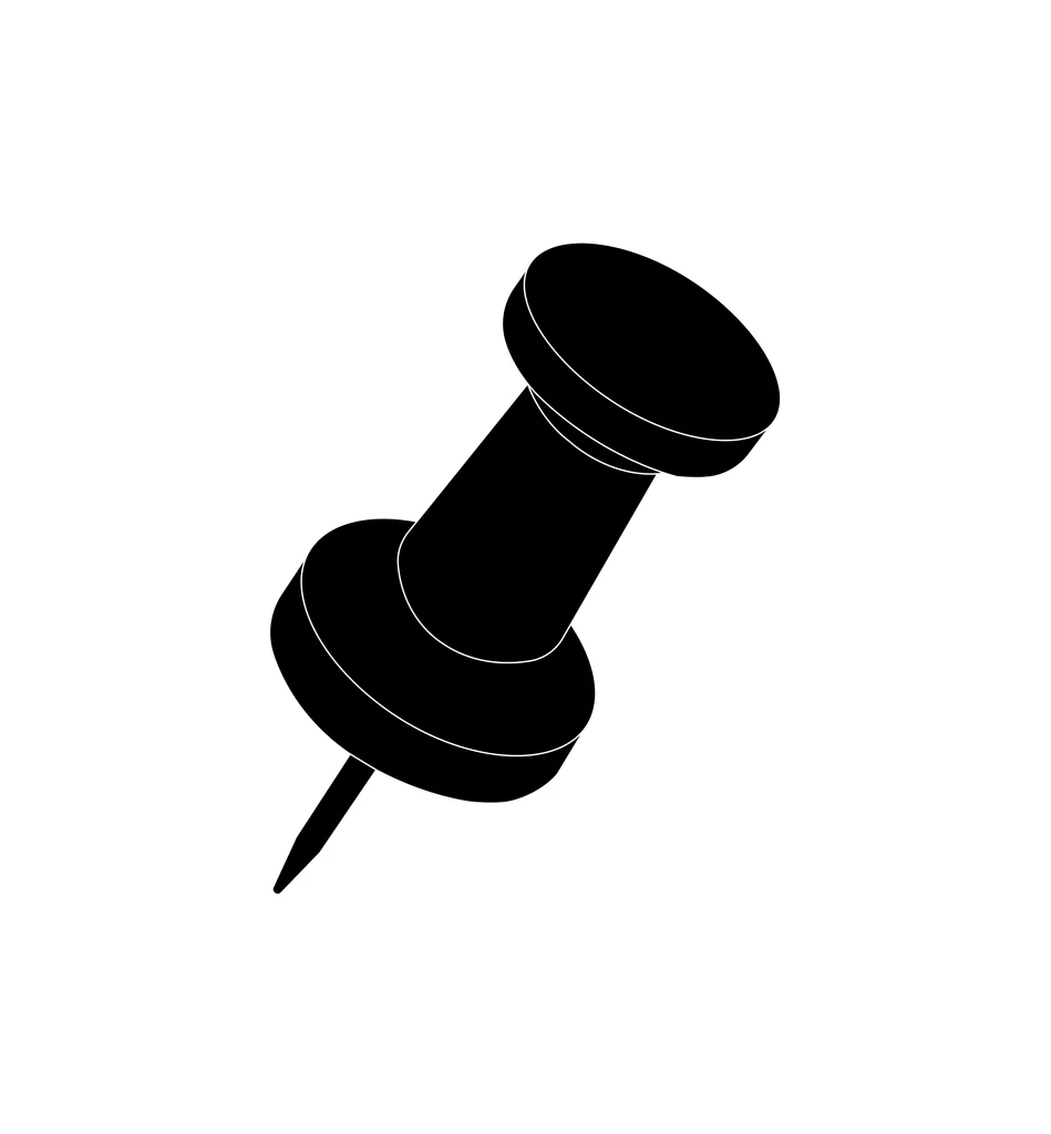
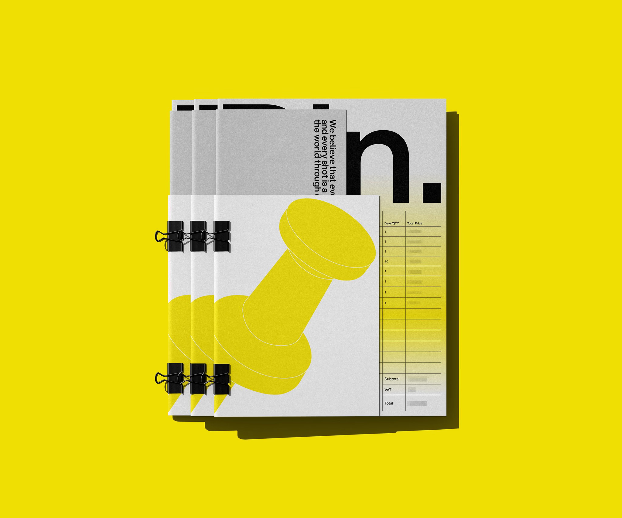
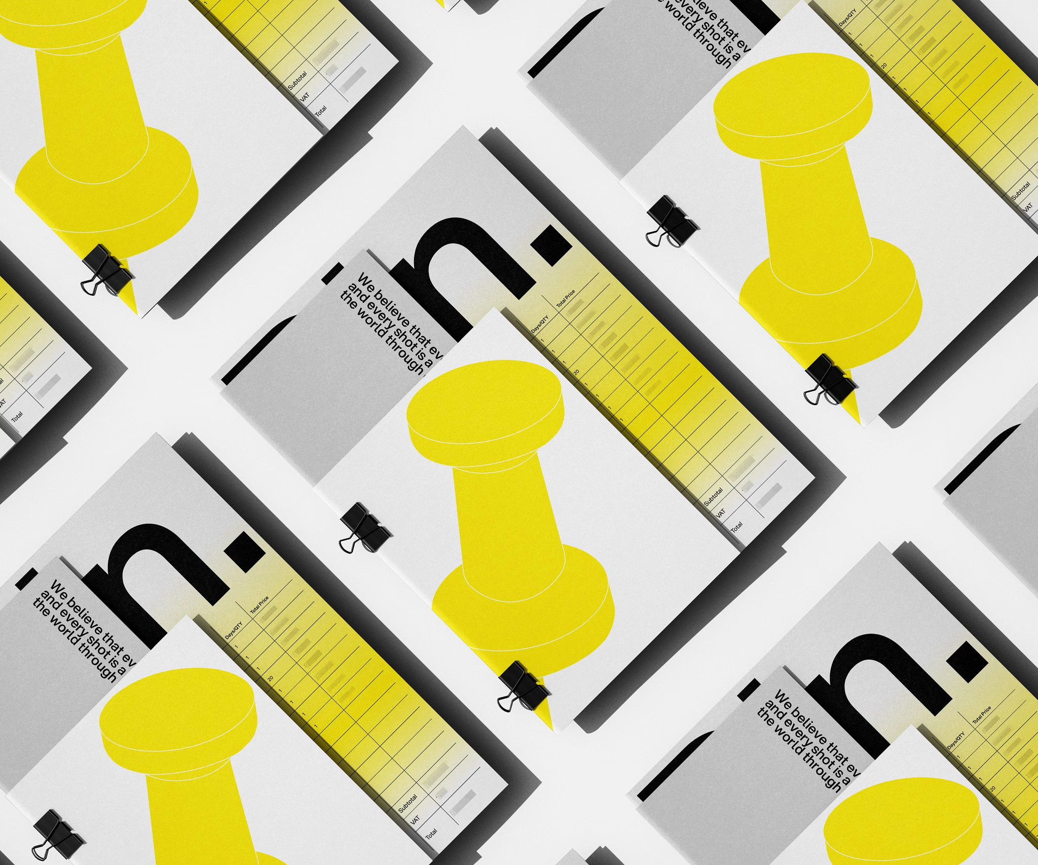
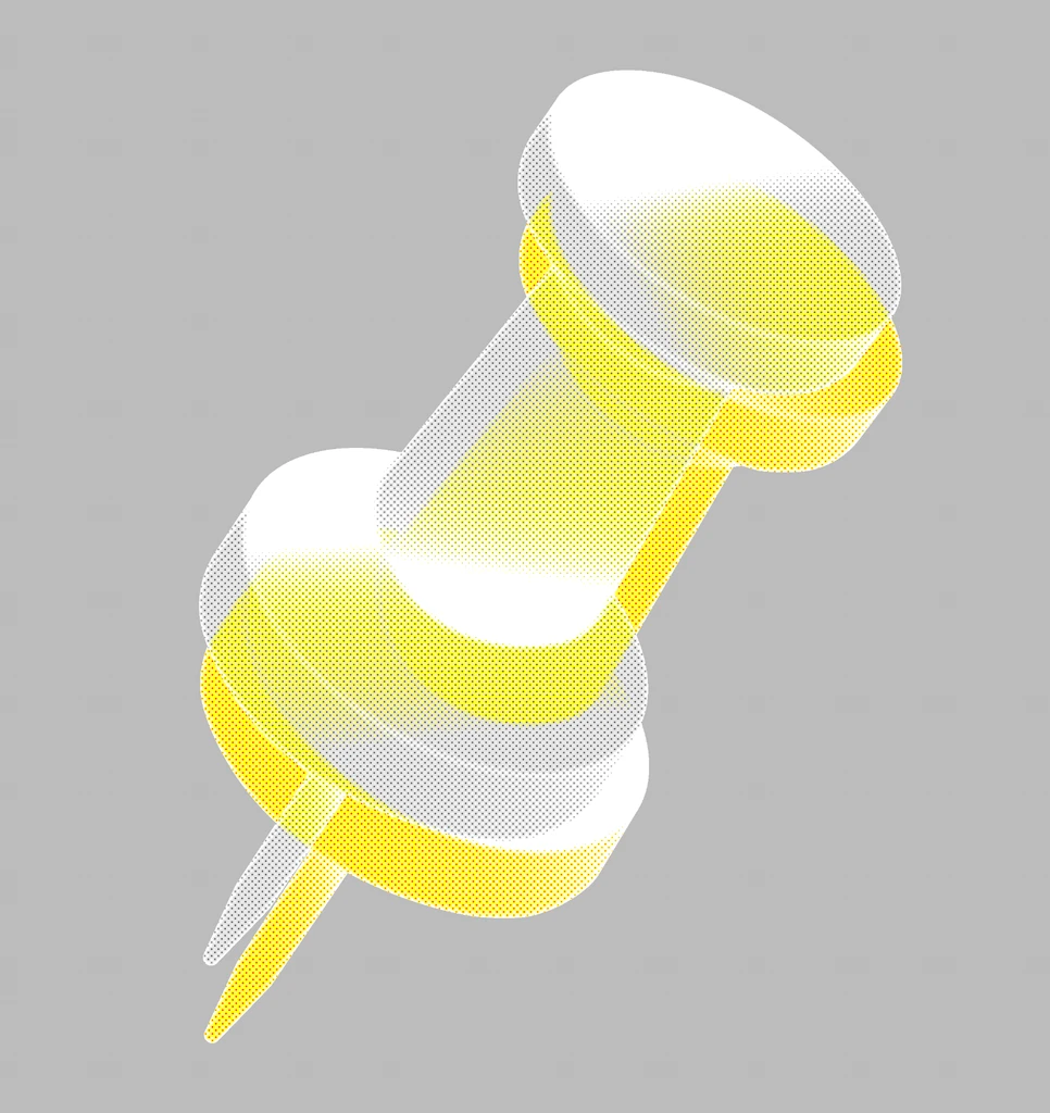
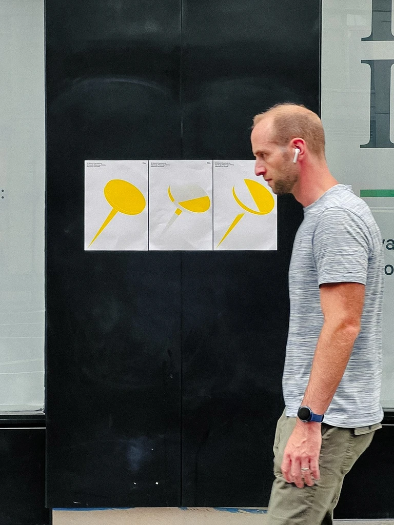
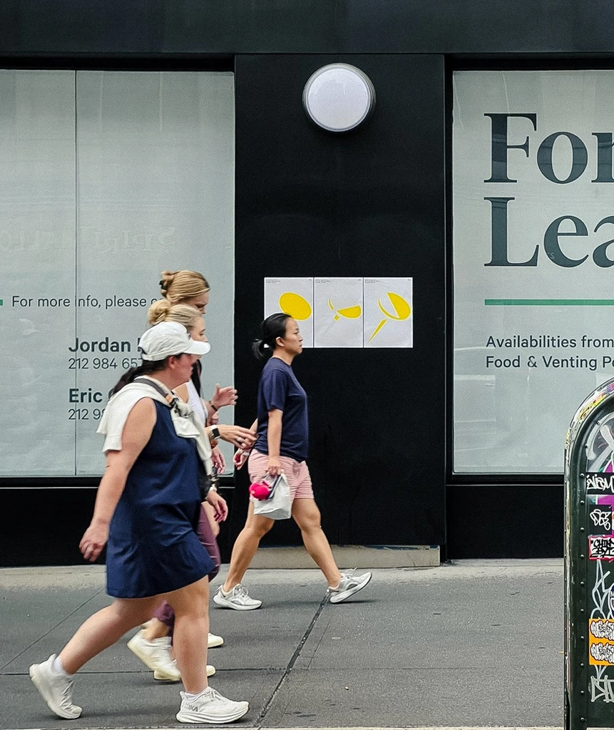
브랜드 심볼은 ‘핀’의 구조적 형태에서 착안해 정밀함과 안정감 속의 긴장감을 시각화했습니다. 컬러 팔레트는 Zinc Yellow, Silver, White로 구성되었으며, 경계가 부드럽게 이어지는 그라데이션은
브랜드가 가진 유연한 사고와 실험적 태도를 시각적으로 표현합니다.
Pin Production is a production studio that explores new visual languages through deep thinking and creative experimentation. Pin analyzes the essence of ideas and translates its philosophy into structured forms, embracing experimentation and dialogue as an integral part of creation. The studio works with an attitude that values process and meaning above all else.
Based on this philosophy, TIN developed a new brand identity for Pin Production. This project was not a simple renewal, but a visualization of the brand’s way of thinking and structural logic.
The name “Pin” originates from four key concepts, Praxinoscope, Circle, Infinity, and Continuity. The praxinoscope represents the principle of motion created by sequential images; the circle connects that movement into a continuous flow; and infinity and continuity symbolize the endless extension of that motion. At the center lies the pin, the axis that fixes and connects everything together, a metaphor for movement, connection, and continuity, the core of the brand’s philosophy.
The brand symbol draws inspiration from the structural form of a pin, visualizing precision and stability with a subtle sense of tension. The color palette, Zinc Yellow, Silver, and White, features smooth gradients that express the brand’s flexible mindset and experimental spirit in a refined, visual language.
About this project
브랜드 아이덴티티, 크리에이티브 디렉션, 네이밍, 브랜드 가이드라인, 서식류 디자인
Brand Identity, Creative Direction, Naming, Brand Guideline, Stationery Design
Project Site
↗
프로젝트 상담
↗
About this project
Pin Production은 깊이 있는 사고와 창의적 실험정신을 바탕으로 새로운 시각 언어를 탐구하는 프로덕션입니다. Pin은 아이디어의 본질을 분석하고 그 철학을 구조적으로 구현하는 스튜디오입니다. 실험과 대화를 창작의 일부로 받아들이며, 과정과 의미를 중시하는 태도로 일합니다.
TIN은 이러한 철학을 토대로 Pin Production의 새로운 브랜드 아이덴티티를 구축했습니다. 이 프로젝트는 단순한 리뉴얼이 아니라, 브랜드의 사고방식을 시각적으로 구조화한 결과물이었습니다.
‘Pin’이라는 이름은 Praxinoscope, Circle, Infinity, Continuity의 네 가지 키워드에서 비롯되었습니다. Praxinoscope는 연속된 이미지로 움직임을 만드는 원리를, Circle은 그 흐름을 하나로 이어주는 구조를, Infinity와 Continuity는 그 움직임의 끝없는 지속을 상징합니다. 그 중심에는 모든 것을 고정하고 연결하는 축, ‘핀(Pin)’이 있습니다. 이 ‘핀’은 움직임과 연결, 그리고 지속성을 상징하는 브랜드의 핵심 메타포입니다.
브랜드 심볼은 ‘핀’의 구조적 형태에서 착안해 정밀함과 안정감 속의 긴장감을 시각화했습니다. 컬러 팔레트는 Zinc Yellow, Silver, White로 구성되었으며, 경계가 부드럽게 이어지는 그라데이션은 브랜드가 가진 유연한 사고와 실험적 태도를 시각적으로 표현합니다.
Pin Production is a production studio that explores new visual languages through deep thinking and creative experimentation. Pin analyzes the essence of ideas and translates its philosophy into structured forms, embracing experimentation and dialogue as an integral part of creation. The studio works with an attitude that values process and meaning above all else.
Based on this philosophy, TIN developed a new brand identity for Pin Production. This project was not a simple renewal, but a visualization of the brand’s way of thinking and structural logic.
The name “Pin” originates from four key concepts, Praxinoscope, Circle, Infinity, and Continuity.
The praxinoscope represents the principle of motion created by sequential images; the circle connects that movement into a continuous flow; and infinity and continuity symbolize the endless extension of that motion. At the center lies the pin, the axis that fixes and connects everything together, a metaphor for movement, connection, and continuity, the core of the brand’s philosophy.
The brand symbol draws inspiration from the structural form of a pin, visualizing precision and stability with a subtle sense of tension. The color palette, Zinc Yellow, Silver, and White, features smooth gradients that express the brand’s flexible mindset and experimental spirit in a refined, visual language.
About this project
브랜드 아이덴티티, 크리에이티브 디렉션, 네이밍, 브랜드 가이드라인, 서식류 디자인
Brand Identity, Creative Direction, Naming, Brand Guideline, Stationery Design
Project Site
↗
프로젝트 상담
↗
About this project
Pin Production은 깊이 있는 사고와 창의적 실험정신을 바탕으로
새로운 시각 언어를 탐구하는 프로덕션입니다. Pin은 아이디어의 본질을 분석하고 그 철학을 구조적으로 구현하는 스튜디오입니다.
실험과 대화를 창작의 일부로 받아들이며, 과정과 의미를 중시하는 태도로 일합니다.
TIN은 이러한 철학을 토대로 Pin Production의 새로운 브랜드 아이덴티티를 구축했습니다. 이 프로젝트는 단순한 리뉴얼이 아니라, 브랜드의 사고방식을 시각적으로 구조화한 결과물이었습니다.
‘Pin’이라는 이름은 Praxinoscope, Circle, Infinity, Continuity의 네 가지 키워드에서 비롯되었습니다. Praxinoscope는 연속된 이미지로 움직임을 만드는 원리를, Circle은 그 흐름을 하나로 이어주는 구조를, Infinity와 Continuity는 그 움직임의 끝없는 지속을 상징합니다. 그 중심에는 모든 것을 고정하고 연결하는 축, ‘핀(Pin)’이 있습니다. 이 ‘핀’은 움직임과 연결, 그리고 지속성을 상징하는 브랜드의 핵심 메타포입니다.
브랜드 심볼은 ‘핀’의 구조적 형태에서 착안해 정밀함과 안정감 속의 긴장감을 시각화했습니다. 컬러 팔레트는 Zinc Yellow, Silver, White로 구성되었으며, 경계가 부드럽게 이어지는 그라데이션은
브랜드가 가진 유연한 사고와 실험적 태도를 시각적으로 표현합니다.
Pin Production is a production studio that explores new visual languages through deep thinking and creative experimentation. Pin analyzes the essence of ideas and translates its philosophy into structured forms, embracing experimentation and dialogue as an integral part of creation. The studio works with an attitude that values process and meaning above all else.
Based on this philosophy, TIN developed a new brand identity for Pin Production. This project was not a simple renewal, but a visualization of the brand’s way of thinking and structural logic.
The name “Pin” originates from four key concepts, Praxinoscope, Circle, Infinity, and Continuity. The praxinoscope represents the principle of motion created by sequential images; the circle connects that movement into a continuous flow; and infinity and continuity symbolize the endless extension of that motion. At the center lies the pin, the axis that fixes and connects everything together, a metaphor for movement, connection, and continuity, the core of the brand’s philosophy.
The brand symbol draws inspiration from the structural form of a pin, visualizing precision and stability with a subtle sense of tension. The color palette, Zinc Yellow, Silver, and White, features smooth gradients that express the brand’s flexible mindset and experimental spirit in a refined, visual language.
What we did
브랜드 아이덴티티, 크리에이티브 디렉션, 네이밍, 브랜드 가이드라인, 서식류 디자인
Brand Identity, Creative Direction, Naming, Brand Guideline, Stationery Design
Project Site
↗
프로젝트 상담
↗