


About this project
서울 한옥주간과 그 전시 프로그램인 공간의 울림(Resonance of Space) 프로젝트는 전통과 현대의 조화, 그리고 공간의 미학을 시각적으로 풀어낸 브랜딩 작업입니다. 두 프로젝트는 하나의 맥락을 공유하면서도, 각각의 주제와 성격에 맞게 독립적인 시각 언어로 설계되었습니다.
서울 한옥주간 브랜딩
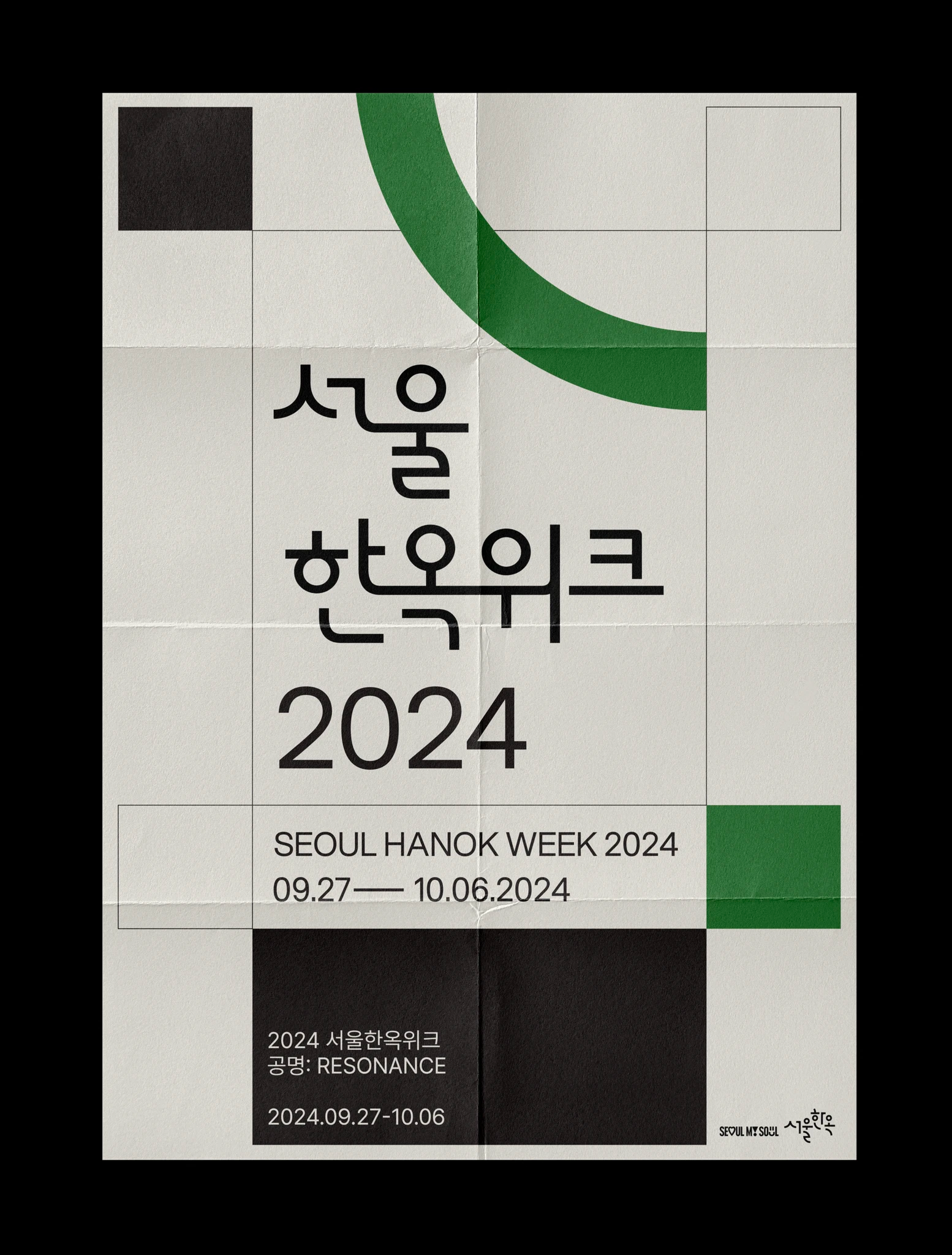
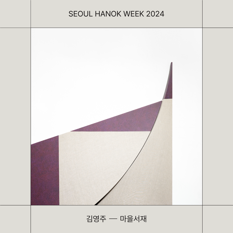
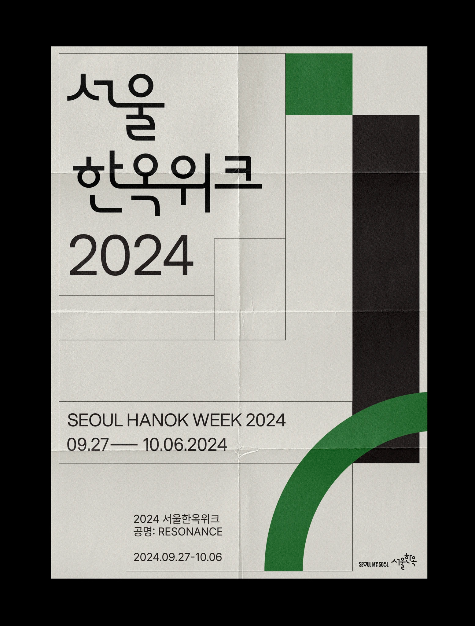
‘서울 한옥’ 기존 BI의 녹색을 포인트 컬러로 사용하고, 블랙과 아이보리를 조합하여 한옥의 자연스럽고 안정된 이미지를 표현했습니다. 한글 타이포그래피는 한옥의 곡선미와 구조미를 시각적으로 담아냈으며, 메인 그래픽은 다양한 정사각형의 조합으로 구성되어 공간감과 구조적인 아름다움을 강조했습니다. 단순한 형태이지만, 전통 한옥의 복합적인 건축 요소를 현대적으로 재해석한 디자인입니다.
공간의 울림 전시 브랜딩
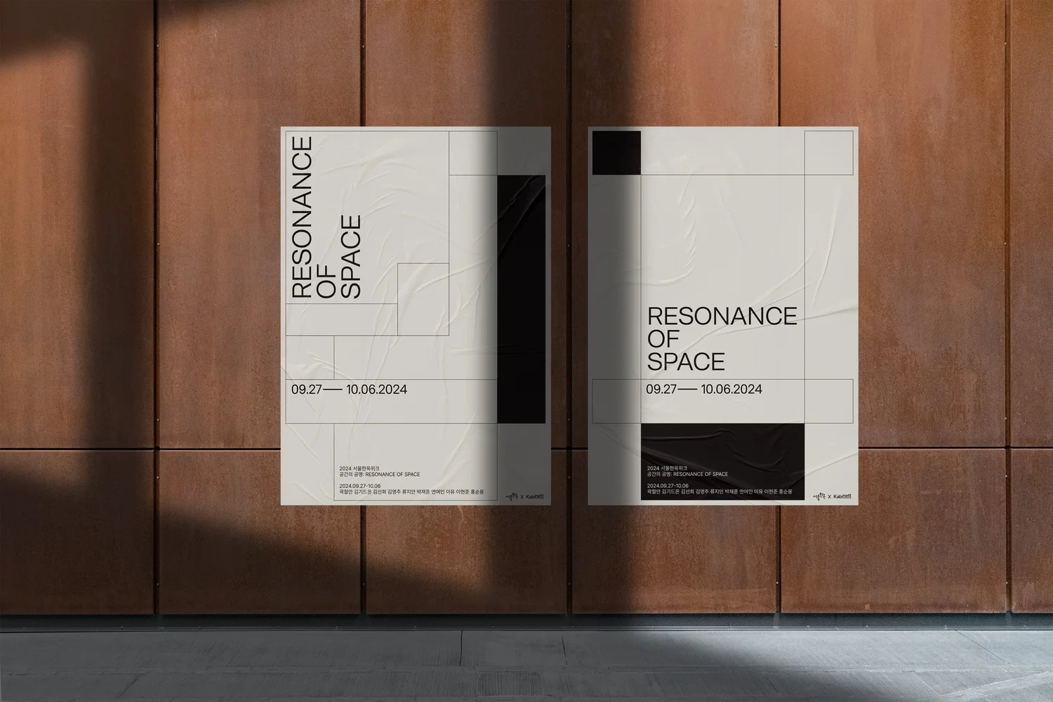
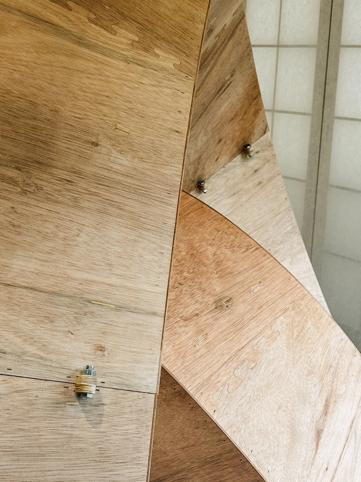
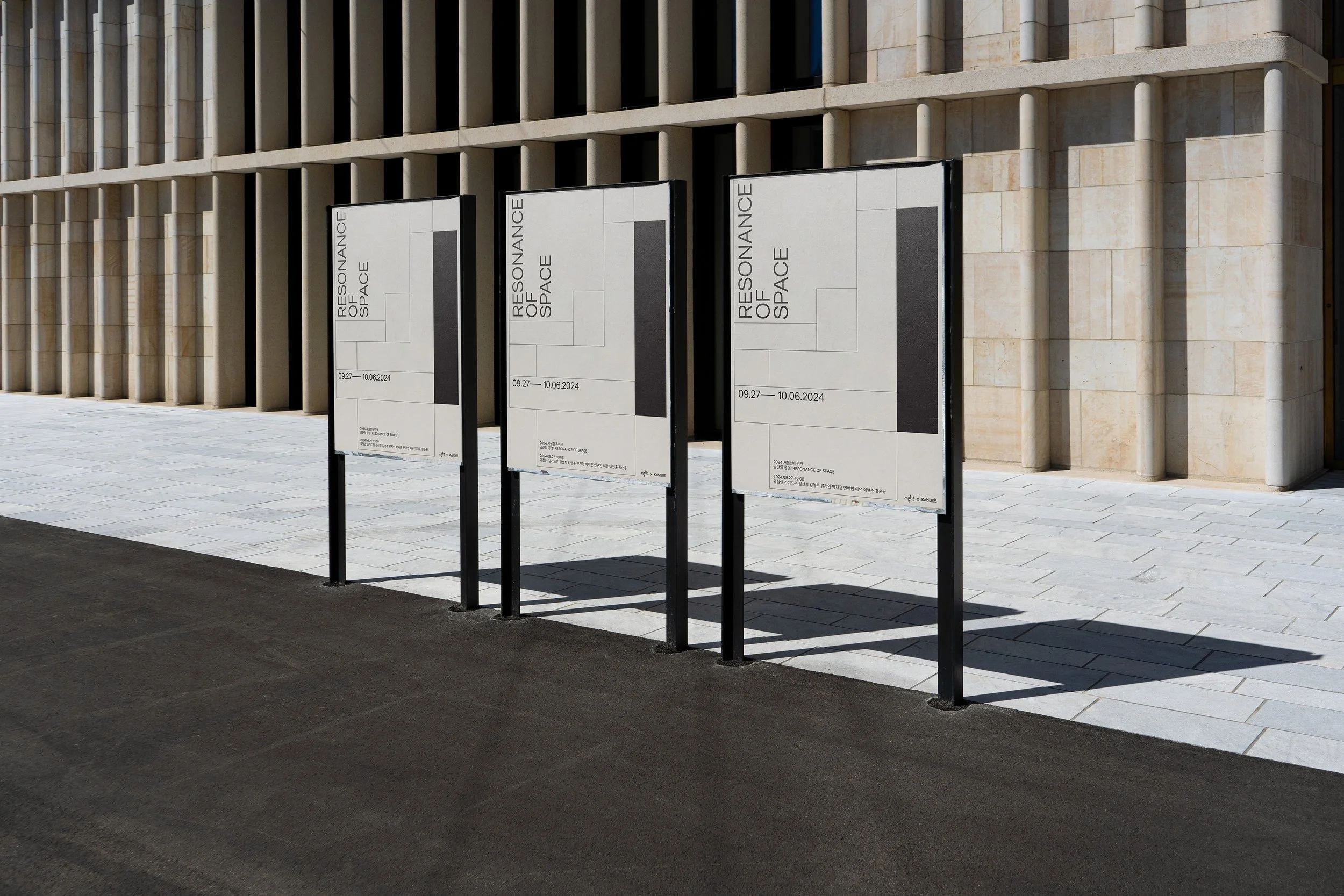
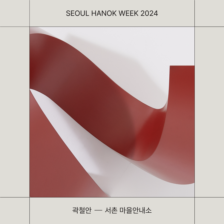
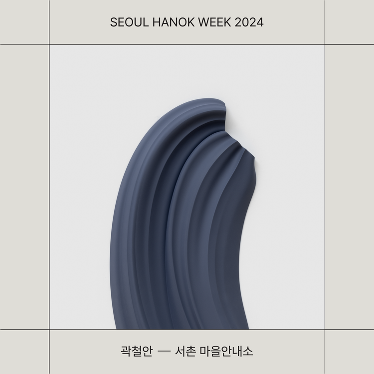
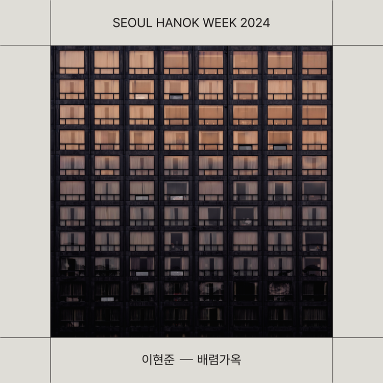
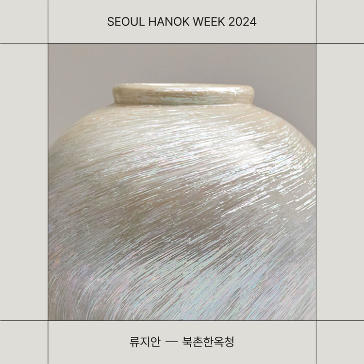
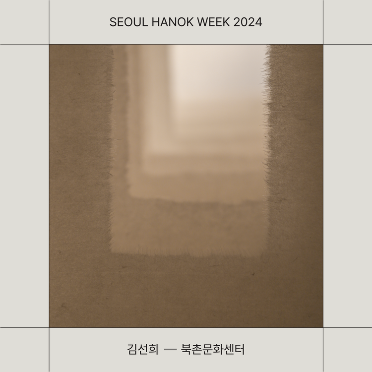
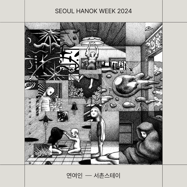
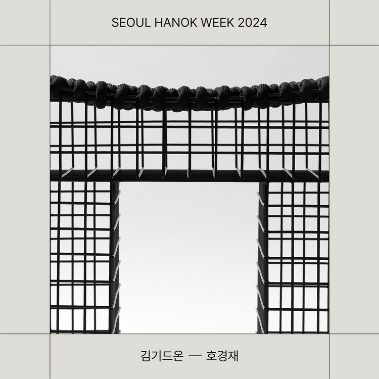
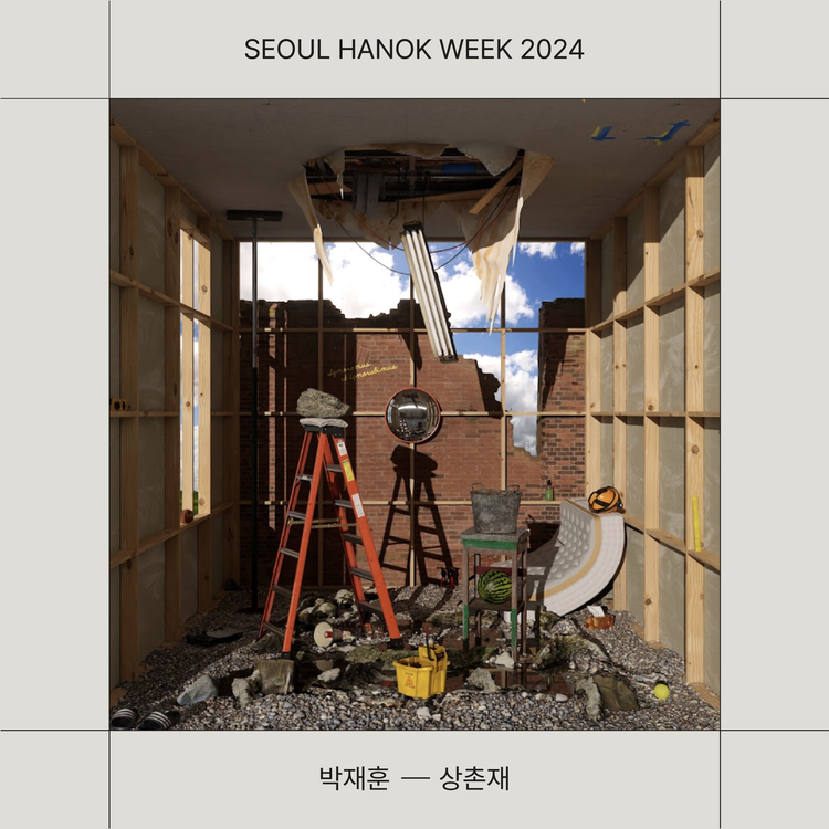
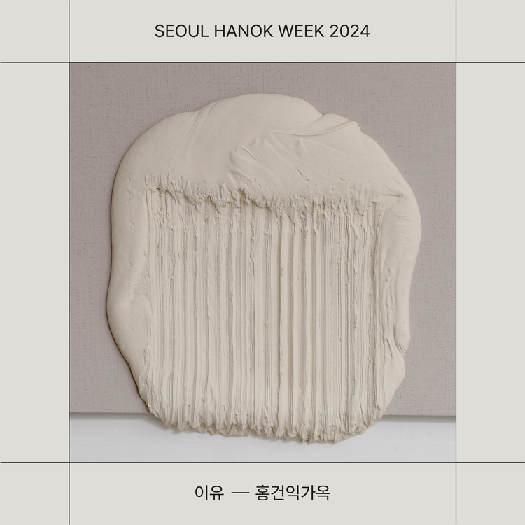
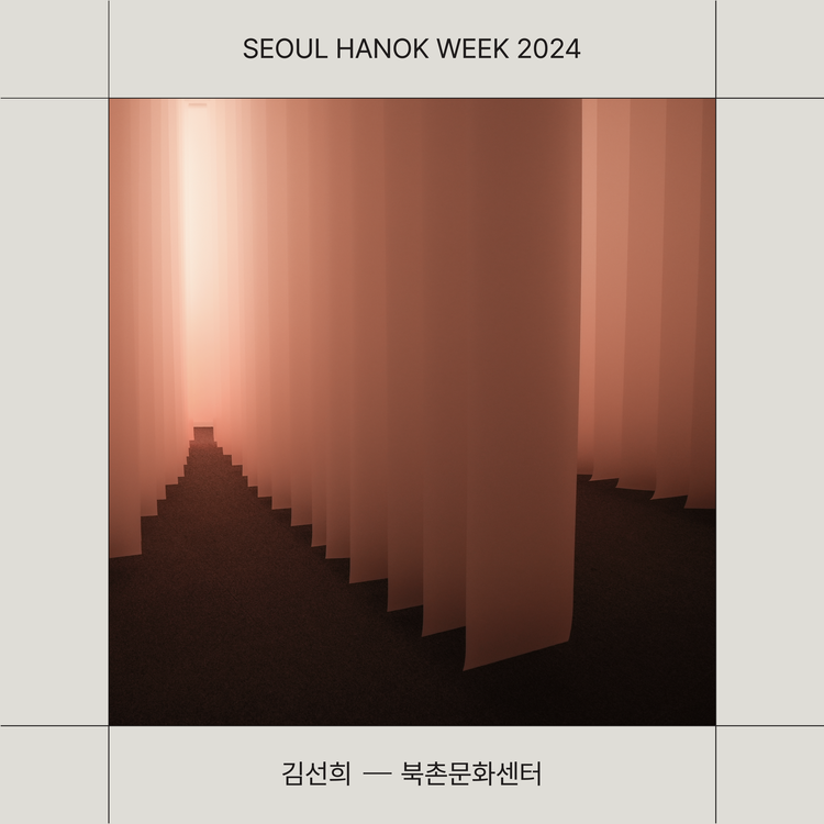
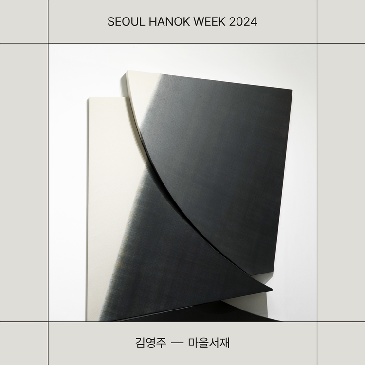
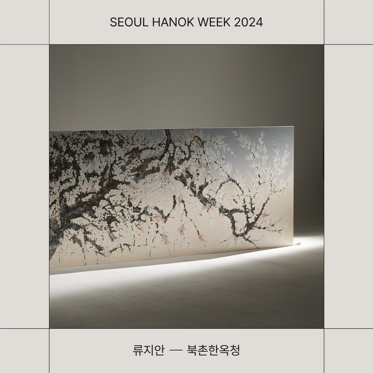
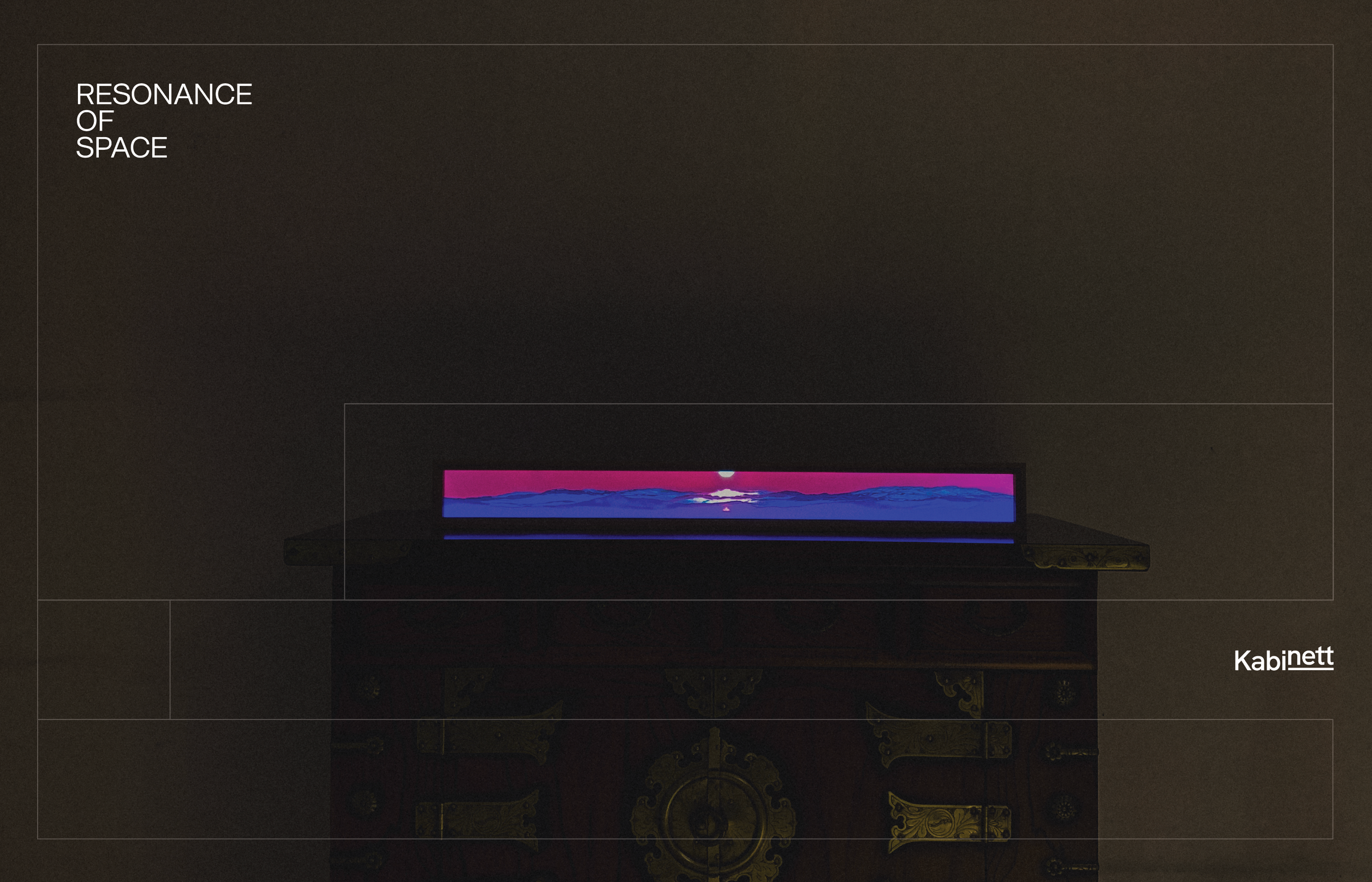
전시 브랜딩은 서울 한옥주간의 정체성과 연결성을 유지하면서도, 녹색을 배제하고 블랙과 아이보리의 조합으로 한옥의 장엄함, 우아함, 그리고 고요함을 표현했습니다. 선으로 이루어진 단순한 정사각형 그래픽은 공간의 구조를 은유하며, ‘한옥의 공간과 울림’이라는 전시의 주제를 시각적으로 전달했습니다.
두 프로젝트는 한옥의 전통적 아름다움을 현대적 디자인 언어로 재해석하며, 각 목적에 따라 차별화된 색상과 그래픽을 활용해 전통과 현대가 조화롭게 공존하는 브랜드 경험을 완성했습니다.
The branding and design for Seoul Hanok Week and its exhibition program, Resonance of Space, highlight the harmony between tradition and modernity and the aesthetics of space. Both projects share the same foundation yet hold distinct identities, each carefully crafted to align with its unique theme and atmosphere.
Seoul Hanok Week Branding
The branding for Seoul Hanok Week used the existing green color from the ‘Seoul Hanok’ identity as a point color, complemented by black and ivory tones to convey the natural and grounded image of Hanok. Korean typography was utilized to visually express the elegant curves and structure of Hanok architecture. The main graphic motif consisted of various square compositions, symbolizing spatial balance and the geometric beauty of traditional architecture, reinterpreted in a modern, minimal way.
Resonance of Space Exhibition Branding
The exhibition branding maintained a visual connection with Seoul Hanok Week but introduced an independent aesthetic. Excluding the green, a restrained palette of black and ivory emphasized the grandeur, calmness, and elegance of Hanok. Through the use of simple linear square structures, the design conveyed the sense of space and resonance that defines Hanok’s architectural philosophy.
Together, the two projects reinterpreted the timeless beauty of Hanok through a modern design language, creating a unified yet distinctive visual narrative where tradition and modernity coexist in harmony.
What we did
크리에이티브 디렉션, 브랜드 아이덴티티,
전시 디자인
Creative Direction, Brand Identity,
Exhibition Design
Project Site
↗
프로젝트 상담
↗
About this project
서울 한옥주간과 그 전시 프로그램인 공간의 울림(Resonance of Space) 프로젝트는 전통과 현대의 조화, 그리고 공간의 미학을 시각적으로 풀어낸 브랜딩 작업입니다. 두 프로젝트는 하나의 맥락을 공유하면서도, 각각의 주제와 성격에 맞게 독립적인 시각 언어로 설계되었습니다.
서울 한옥주간 브랜딩
‘서울 한옥’ 기존 BI의 녹색을 포인트 컬러로 사용하고, 블랙과 아이보리를 조합하여 한옥의 자연스럽고 안정된 이미지를 표현했습니다. 한글 타이포그래피는 한옥의 곡선미와 구조미를 시각적으로 담아냈으며, 메인 그래픽은 다양한 정사각형의 조합으로 구성되어 공간감과 구조적인 아름다움을 강조했습니다. 단순한 형태이지만, 전통 한옥의 복합적인 건축 요소를 현대적으로 재해석한 디자인입니다.
공간의 울림 전시 브랜딩
전시 브랜딩은 서울 한옥주간의 정체성과 연결성을 유지하면서도,
녹색을 배제하고 블랙과 아이보리의 조합으로 한옥의 장엄함, 우아함, 그리고 고요함을 표현했습니다. 선으로 이루어진 단순한 정사각형 그래픽은 공간의 구조를 은유하며, ‘한옥의 공간과 울림’이라는 전시의 주제를 시각적으로 전달했습니다.
두 프로젝트는 한옥의 전통적 아름다움을 현대적 디자인 언어로 재해석하며, 각 목적에 따라 차별화된 색상과 그래픽을 활용해 전통과 현대가 조화롭게 공존하는 브랜드 경험을 완성했습니다.
The branding and design for Seoul Hanok Week and its exhibition program, Resonance of Space, highlight the harmony between tradition and modernity and the aesthetics of space. Both projects share the same foundation yet hold distinct identities, each carefully crafted to align with its unique theme and atmosphere.
Seoul Hanok Week Branding
The branding for Seoul Hanok Week used the existing green color from the ‘Seoul Hanok’ identity as a point color, complemented by black and ivory tones to convey the natural and grounded image of Hanok. Korean typography was utilized to visually express the elegant curves and structure of Hanok architecture. The main graphic motif consisted of various square compositions, symbolizing spatial balance and the geometric beauty of traditional architecture, reinterpreted in a modern, minimal way.
Resonance of Space Exhibition Branding
The exhibition branding maintained a visual connection with Seoul Hanok Week but introduced an independent aesthetic. Excluding the green, a restrained palette of black and ivory emphasized the grandeur, calmness, and elegance of Hanok. Through the use of simple linear square structures, the design conveyed the sense of space and resonance that defines Hanok’s architectural philosophy.
Together, the two projects reinterpreted the timeless beauty of Hanok through a modern design language, creating a unified yet distinctive visual narrative where tradition and modernity coexist in harmony.
What we did
크리에이티브 디렉션, 브랜드 아이덴티티, 전시 디자인
Creative Direction, Brand Identity, Exhibition Design
Project Site
↗
프로젝트 상담
↗