
About this project
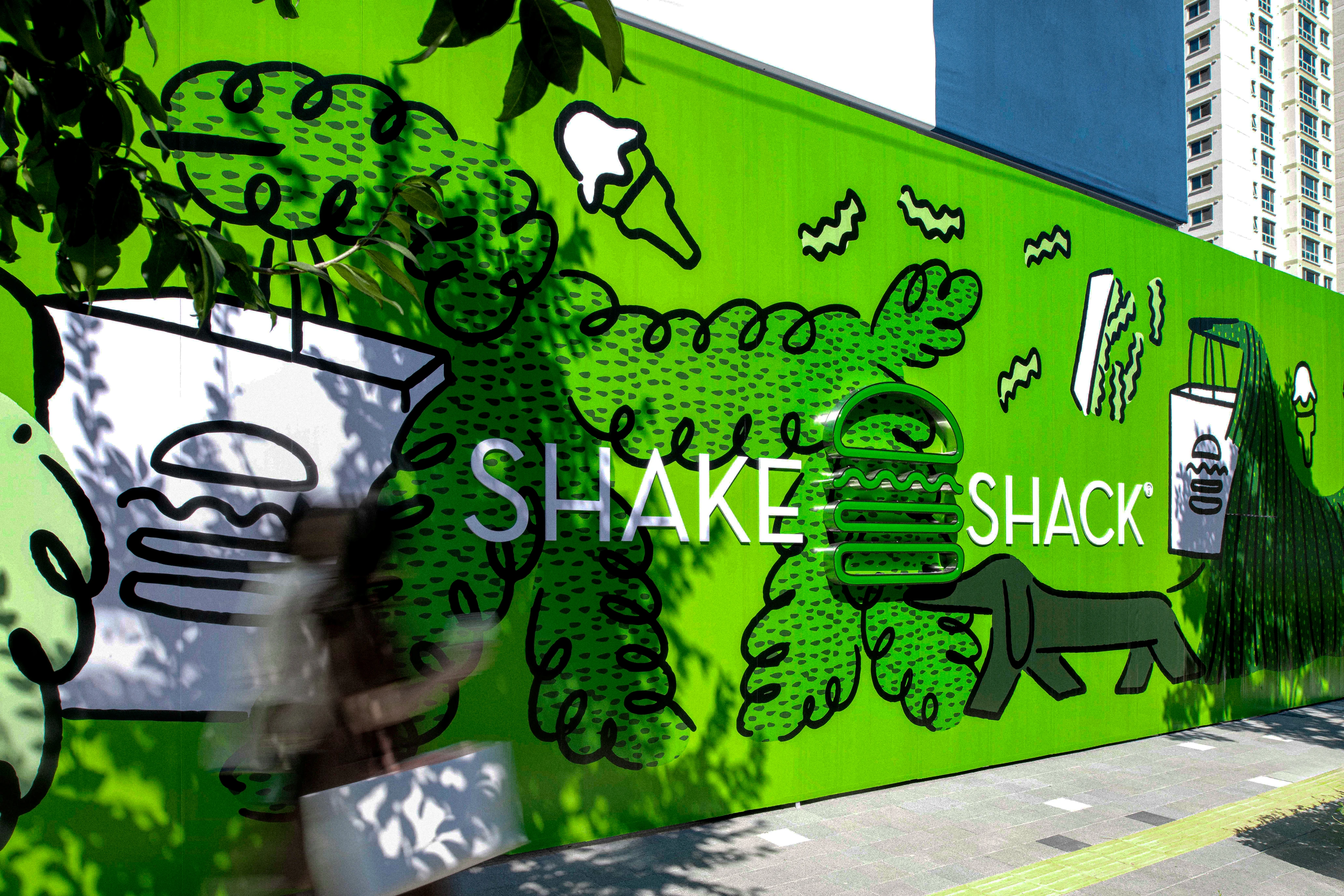
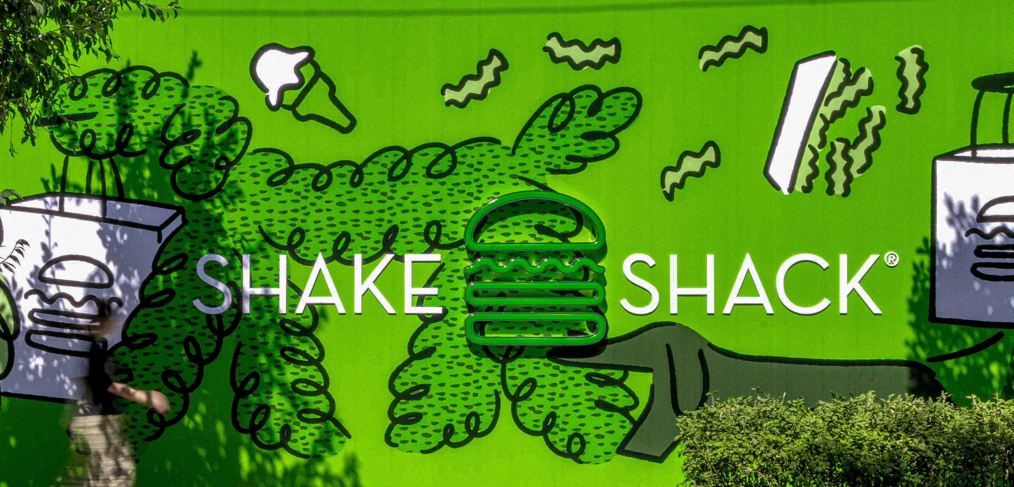
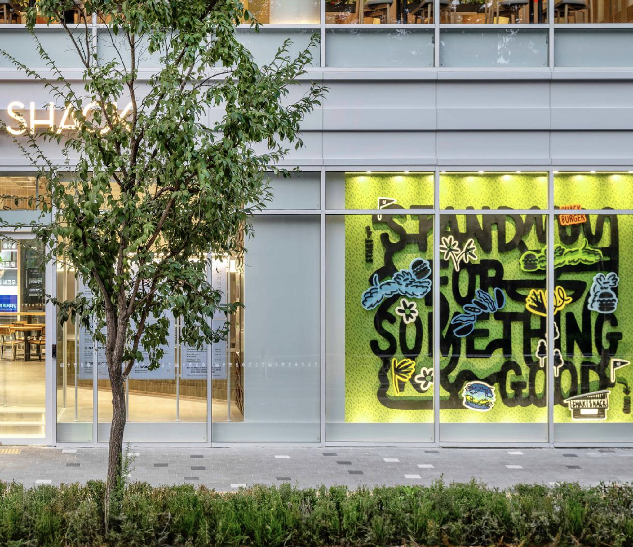
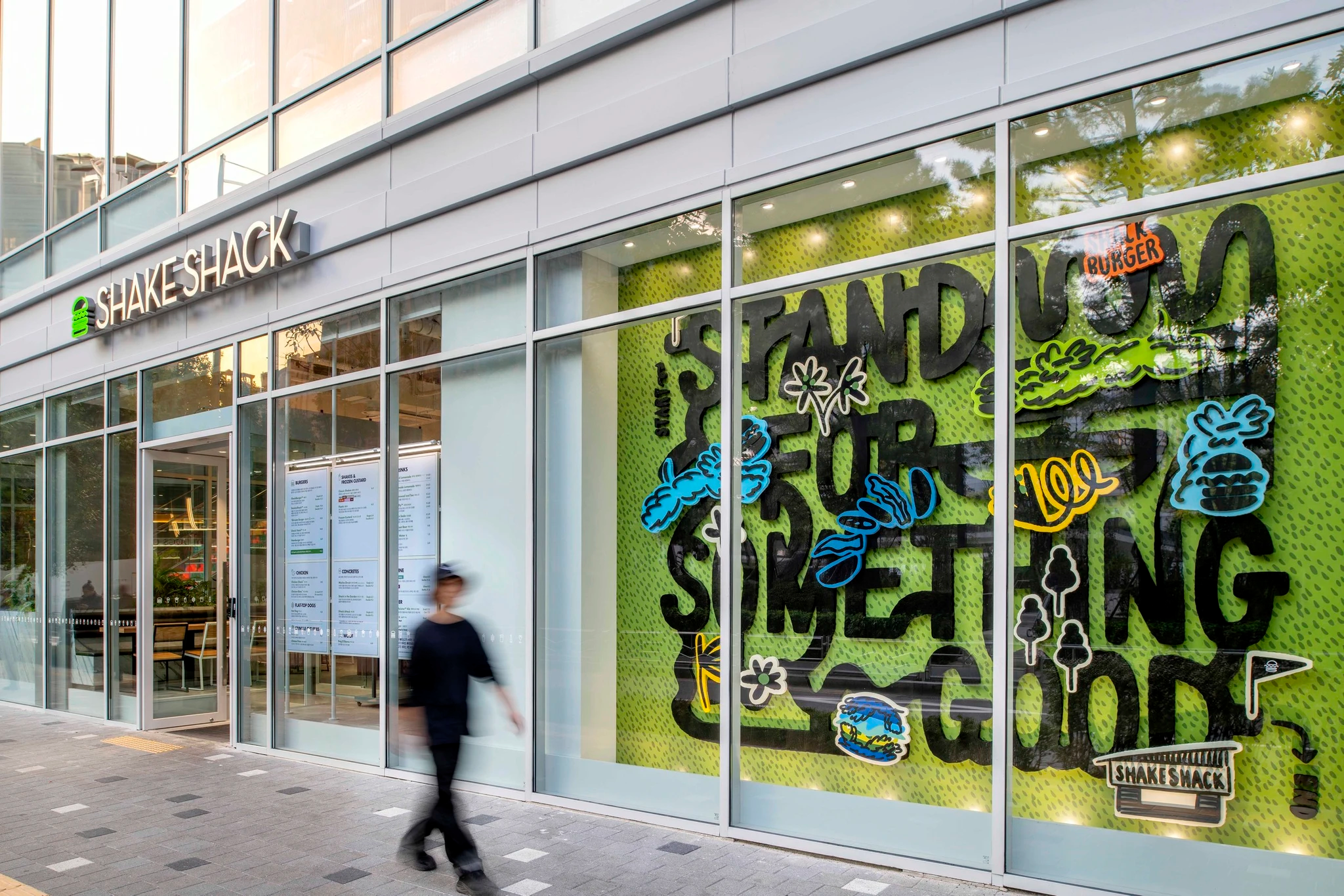
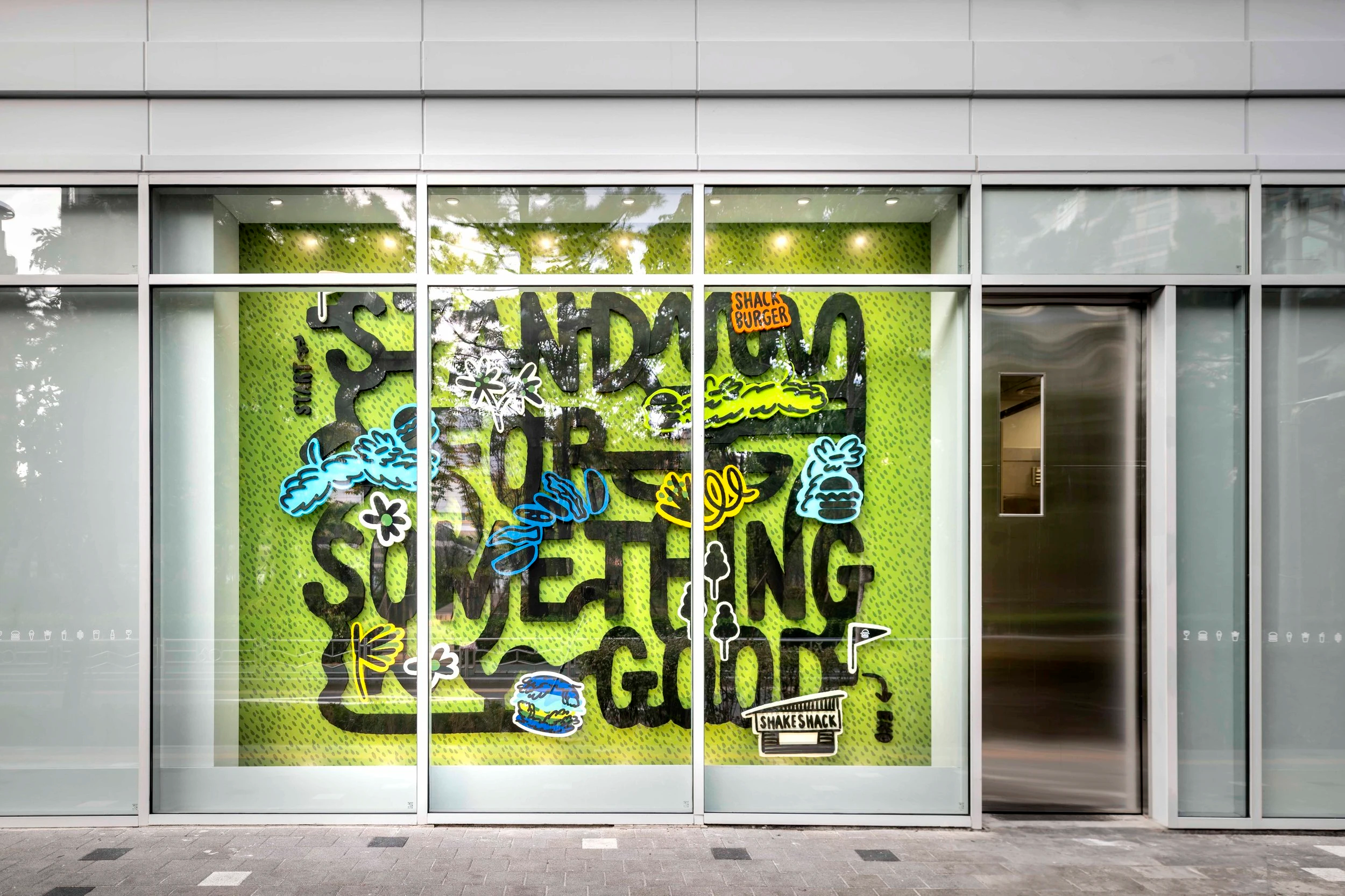
쉐이크쉑(Shake Shack)은 서울 양천구 목동 SBS 사옥 1층에 27번째 매장을 오픈했습니다. 이번 목동점은 주거 밀집 지역인 오목공원 앞에 위치해 있으며, 뉴욕 1호점 매디슨스퀘어파크점처럼 지역사회와 자연스럽게 어우러지는 매장으로 설계되었습니다.
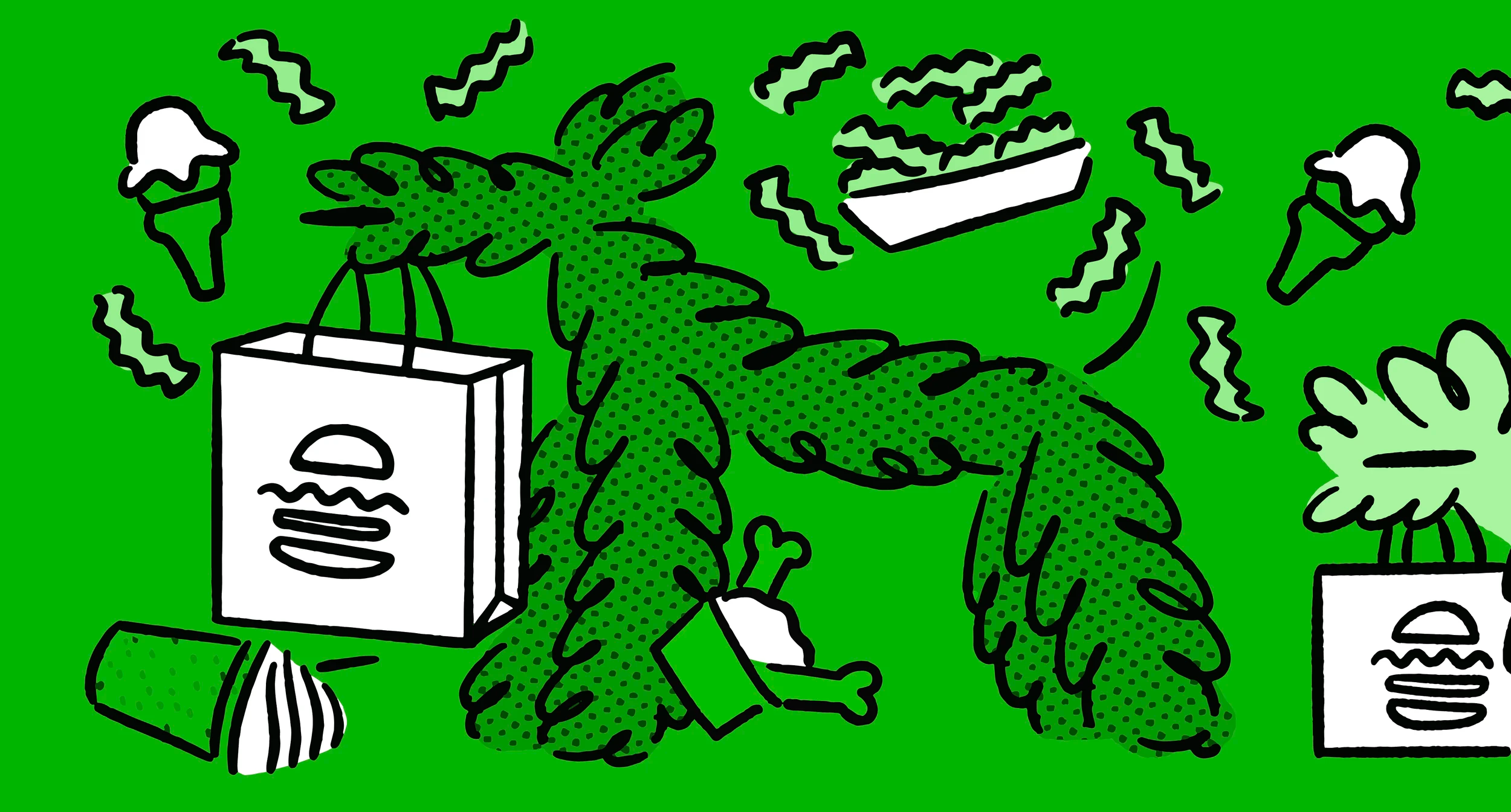
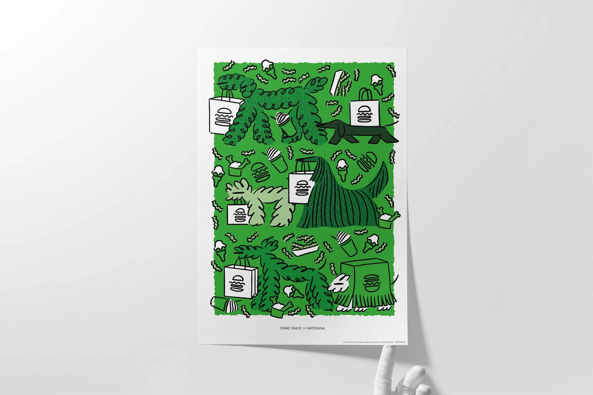
TIN은 쉐이크쉑의 브랜드 슬로건 ‘Stand For Something Good’을 시각적으로 재해석하여, 브랜드로 향하는 여정을 미로 형태의 실내 및 외부 호딩 아트워크로 구현했습니다. 이번 작업은 공원의 특성을 반영하여, 멀리서 바라볼 때는 시각적인 즐거움을, 가까이 다가왔을 때는 마치 게임을 하듯 참여적이고 탐험적인 경험을 제공합니다.
‘Stand For Something Good’의 개념을 ‘길’로 형상화함으로써, 방문객들이 쉐이크쉑으로 향하는 여정을 즐겁고 몰입감 있게 체험할 수 있도록 했습니다. TIN의 접근은 단순한 장식이 아닌, 브랜드와 고객을 직관적이고 감각적으로 연결하는 디자인 경험을 목표로 합니다.
Shake Shack opened its 27th store on the first floor of the SBS building in Mokdong, Seoul. Located in front of Omok Park, a residential neighborhood hub, the Mokdong branch embraces the community spirit — much like Shake Shack’s very first location in Madison Square Park, New York.
TIN creatively reinterpreted the brand’s slogan, “Stand For Something Good,” by designing and producing indoor and hoarding artwork that visualizes a journey to the brand in the form of a maze. Inspired by the park’s characteristics, the artwork was designed to be visually engaging from afar while offering an interactive, playful experience up close — transforming a public space into an extension of the brand experience.
By visualizing the slogan as a path, the project invites visitors to enjoy an immersive and intuitive journey toward Shake Shack. TIN’s approach goes beyond decoration, focusing on creating a sensory connection between the brand and its audience.
About this project
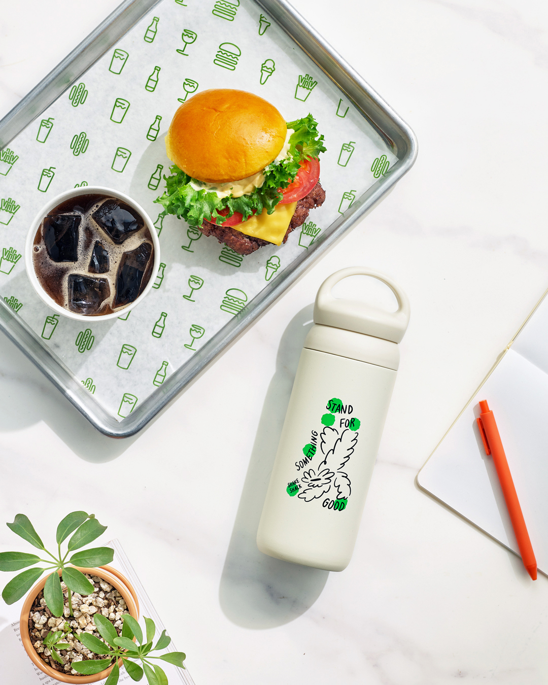
아트 디렉션, 일러스트레이션, 포스터 디자인
Art Direction, Illustration, Poster Design
Project Site
↗
프로젝트 상담
↗


About this project
쉐이크쉑(Shake Shack)은 서울 양천구 목동 SBS 사옥 1층에 27번째 매장을 오픈했습니다. 이번 목동점은 주거 밀집 지역인 오목공원 앞에 위치해 있으며, 뉴욕 1호점 매디슨스퀘어파크점처럼 지역사회와 자연스럽게 어우러지는 매장으로 설계되었습니다.
TIN은 쉐이크쉑의 브랜드 슬로건 ‘Stand For Something Good’을 시각적으로 재해석하여, 브랜드로 향하는 여정을 미로 형태의 실내 및 외부 호딩 아트워크로 구현했습니다. 이번 작업은 공원의 특성을 반영하여, 멀리서 바라볼 때는 시각적인 즐거움을, 가까이 다가왔을 때는 마치 게임을 하듯 참여적이고 탐험적인 경험을 제공합니다.
‘Stand For Something Good’의 개념을 ‘길’로 형상화함으로써, 방문객들이 쉐이크쉑으로 향하는 여정을 즐겁고 몰입감 있게 체험할 수 있도록 했습니다. TIN의 접근은 단순한 장식이 아닌, 브랜드와 고객을 직관적이고 감각적으로 연결하는 디자인 경험을 목표로 합니다.
Shake Shack opened its 27th store on the first floor of the SBS building in Mokdong, Seoul. Located in front of Omok Park, a residential neighborhood hub, the Mokdong branch embraces the community spirit — much like Shake Shack’s very first location in Madison Square Park, New York.
TIN creatively reinterpreted the brand’s slogan, “Stand For Something Good,” by designing and producing indoor and hoarding artwork that visualizes a journey to the brand in the form of a maze. Inspired by the park’s characteristics, the artwork was designed to be visually engaging from afar while offering an interactive, playful experience up close — transforming a public space into an extension of the brand experience.
By visualizing the slogan as a path, the project invites visitors to enjoy an immersive and intuitive journey toward Shake Shack. TIN’s approach goes beyond decoration, focusing on creating a sensory connection between the brand and its audience.
About this project
아트 디렉션, 일러스트레이션, 포스터 디자인
Art Direction, Illustration, Poster Design
Project Site
↗
프로젝트 상담
↗
About this project
쉐이크쉑(Shake Shack)은 서울 양천구 목동 SBS 사옥 1층에 27번째 매장을 오픈했습니다. 이번 목동점은 주거 밀집 지역인 오목공원 앞에 위치해 있으며, 뉴욕 1호점 매디슨스퀘어파크점처럼 지역사회와 자연스럽게 어우러지는 매장으로 설계되었습니다.
TIN은 쉐이크쉑의 브랜드 슬로건 ‘Stand For Something Good’을 시각적으로 재해석하여, 브랜드로 향하는 여정을 미로 형태의 실내 및 외부 호딩 아트워크로 구현했습니다. 이번 작업은 공원의 특성을 반영하여, 멀리서 바라볼 때는 시각적인 즐거움을, 가까이 다가왔을 때는 마치 게임을 하듯 참여적이고 탐험적인 경험을 제공합니다.
‘Stand For Something Good’의 개념을 ‘길’로 형상화함으로써, 방문객들이 쉐이크쉑으로 향하는 여정을 즐겁고 몰입감 있게 체험할 수 있도록 했습니다. TIN의 접근은 단순한 장식이 아닌, 브랜드와 고객을 직관적이고 감각적으로 연결하는 디자인 경험을 목표로 합니다.
Shake Shack opened its 27th store on the first floor of the SBS building in Mokdong, Seoul. Located in front of Omok Park, a residential neighborhood hub, the Mokdong branch embraces the community spirit — much like Shake Shack’s very first location in Madison Square Park, New York.
TIN creatively reinterpreted the brand’s slogan, “Stand For Something Good,” by designing and producing indoor and hoarding artwork that visualizes a journey to the brand in the form of a maze. Inspired by the park’s characteristics, the artwork was designed to be visually engaging from afar while offering an interactive, playful experience up close — transforming a public space into an extension of the brand experience.
By visualizing the slogan as a path, the project invites visitors to enjoy an immersive and intuitive journey toward Shake Shack. TIN’s approach goes beyond decoration, focusing on creating a sensory connection between the brand and its audience.
What we did
아트 디렉션, 일러스트레이션, 포스터 디자인
Art Direction, Illustration, Poster Design
Project Site
↗
프로젝트 상담
↗