


About this project
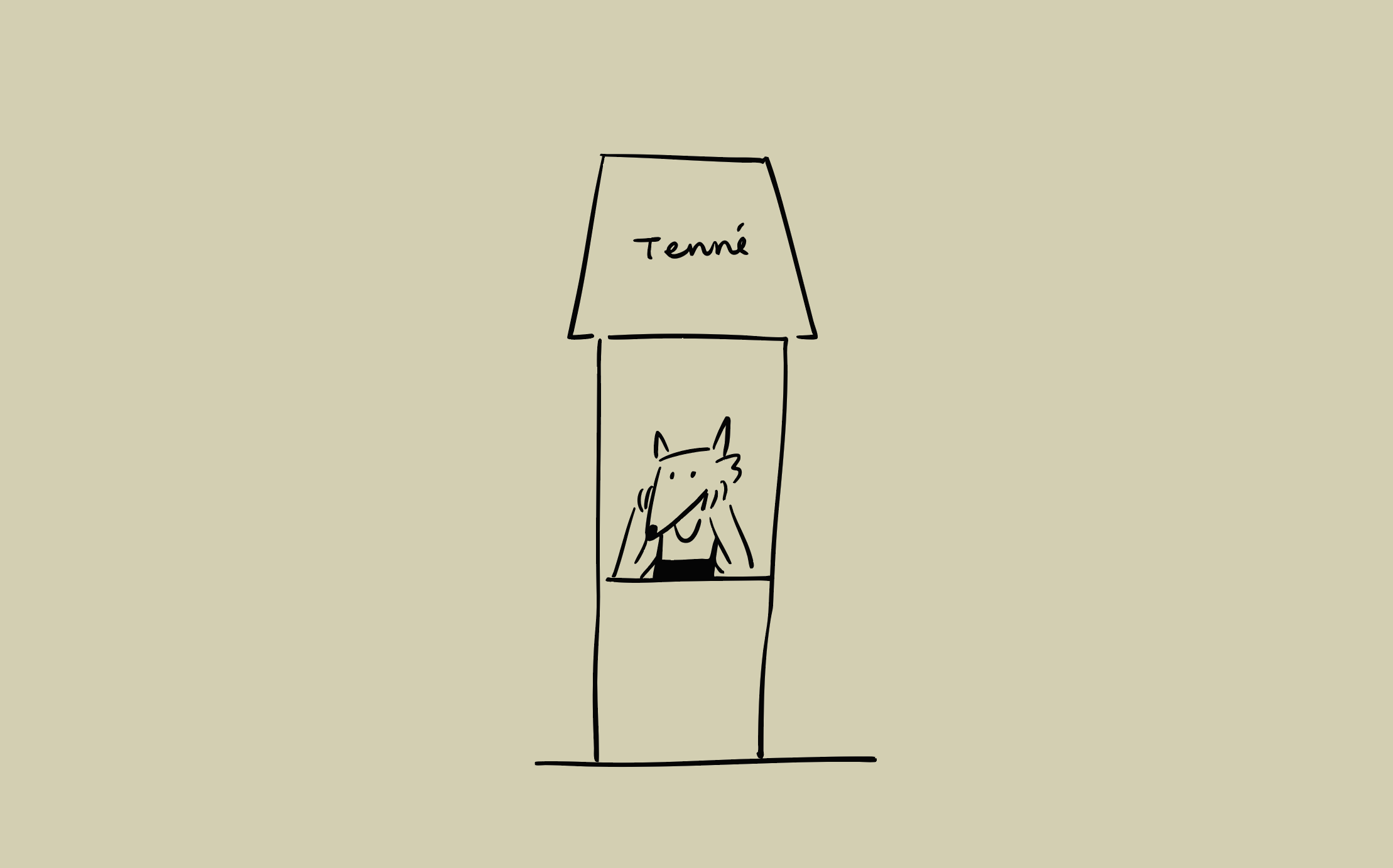
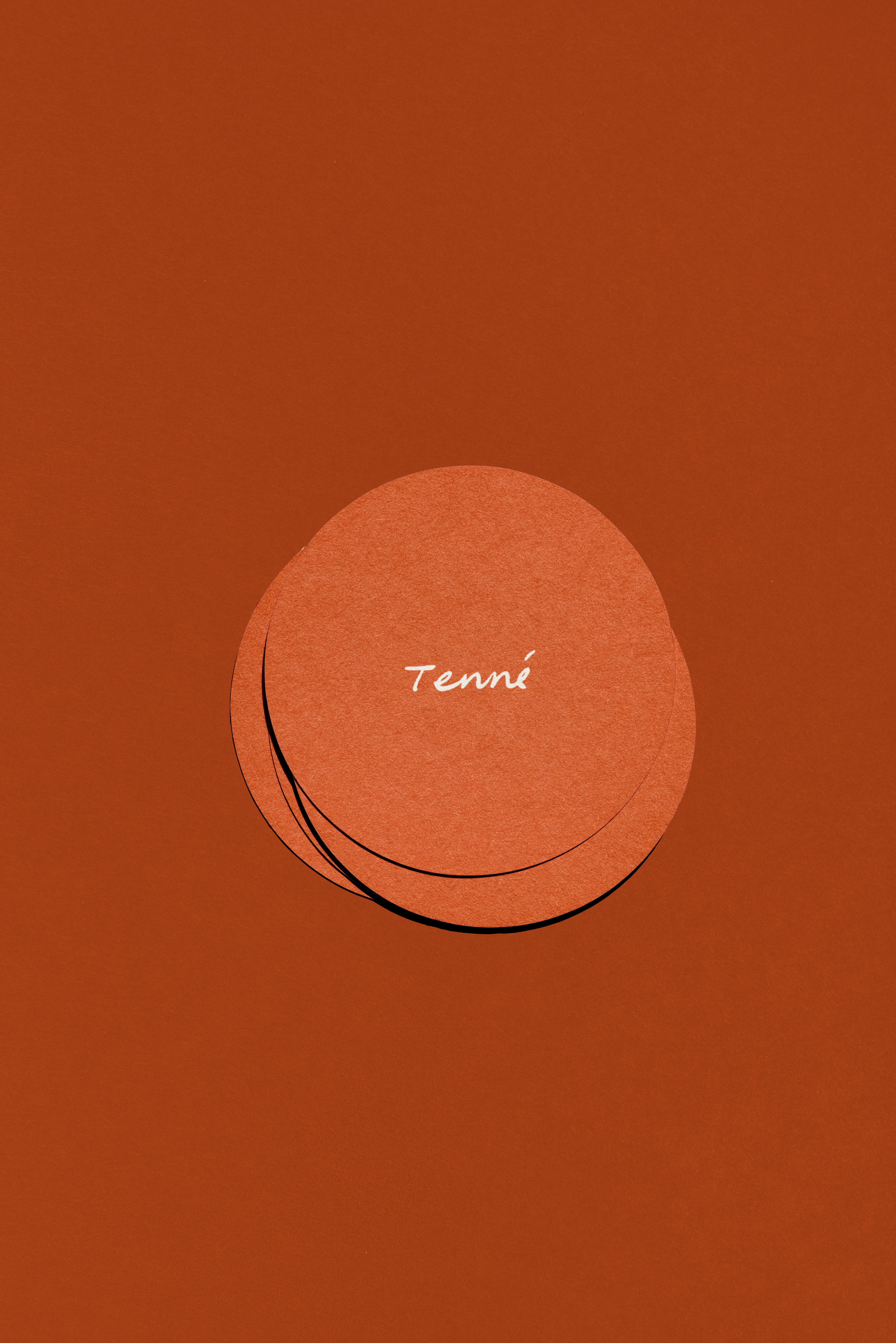
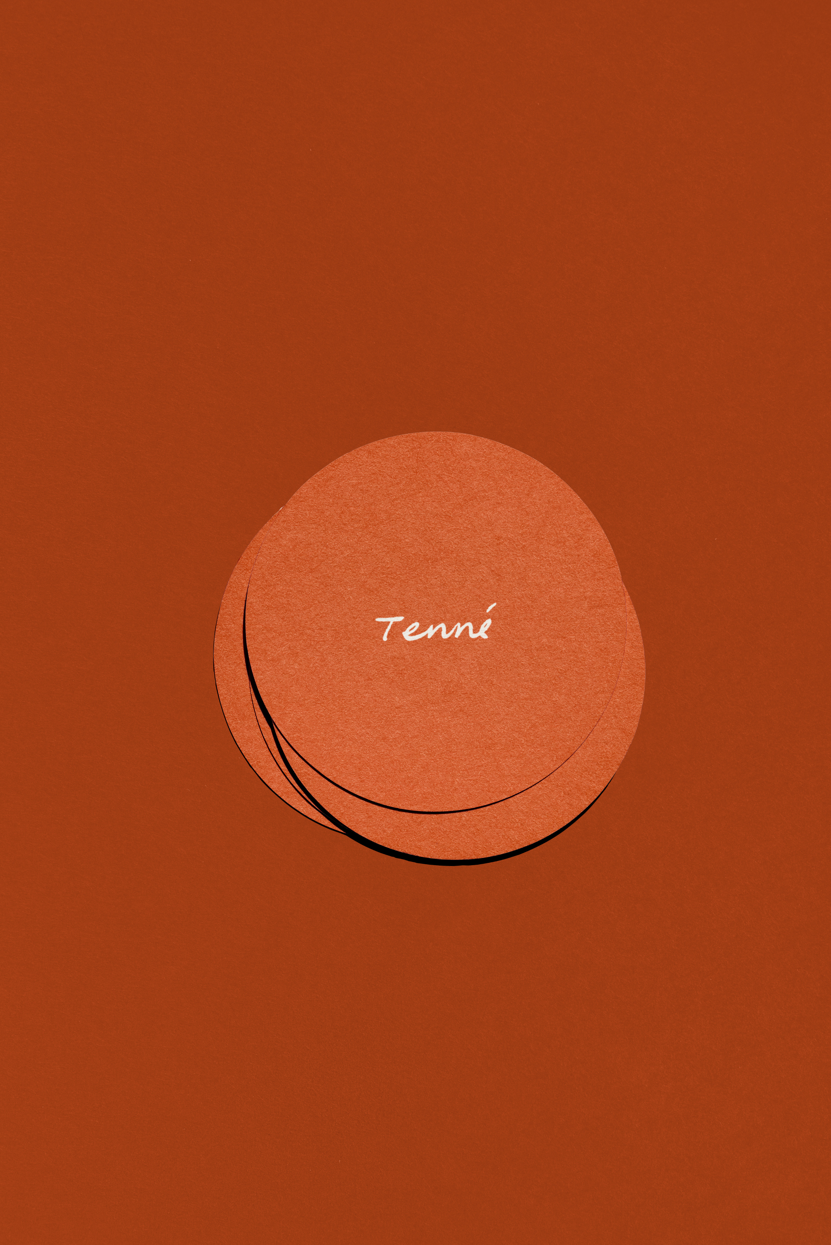
Tenné — 숨쉬는 브랜드
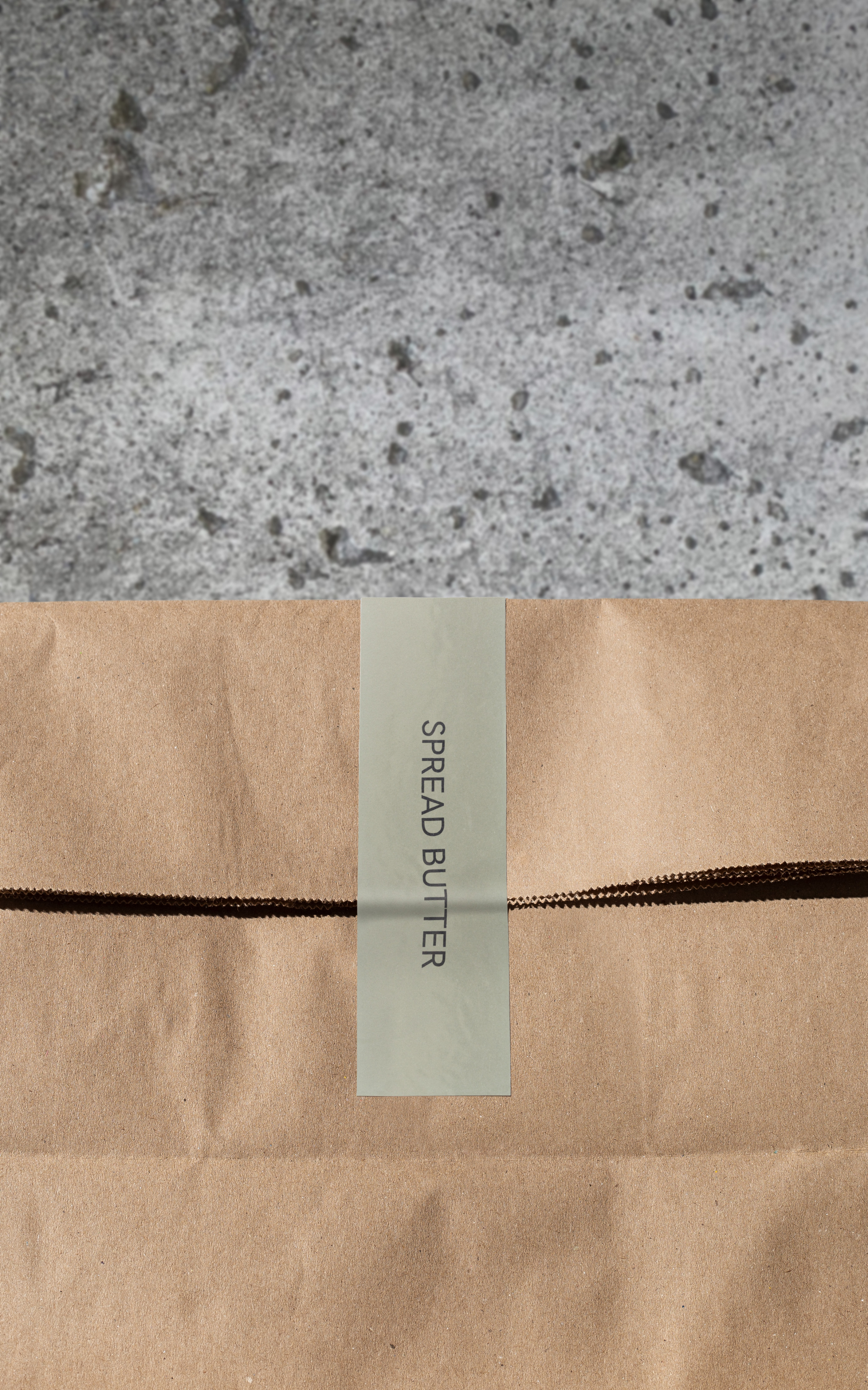
모든 베이커리가 ‘품질’, ‘맛’, ‘분위기’를 이야기하는 시대 속에서, TIN은 더 조용한 길을 택했습니다. Tenné는 ‘비움의 미학’ 위에 세워진 브랜드로, 공간부터 아이덴티티, 커뮤니케이션에 이르기까지 절제의 실험이었습니다. 그 중심에는 따뜻함과 빵, 사랑을 지켜주는 보이지 않는 존재 ‘Tenné’ 가 있습니다.
‘브랜드는 어떻게 침묵 속에서도 존재감을 가질 수 있을까?’ TIN은 이 프로젝트를 장식하는 대신 덜어내고, 보여주는 대신 발견하게 했습니다.
그 과정에서 TIN은 ‘Quiet Branding’ 이라는 이론을 세웠습니다. 디자인, 공간, 이야기의 모든 요소가 소음 없이 조화를 이루도록, 모든 선택은 명료함과 평온함을 지키는 방향으로 이루어졌습니다.
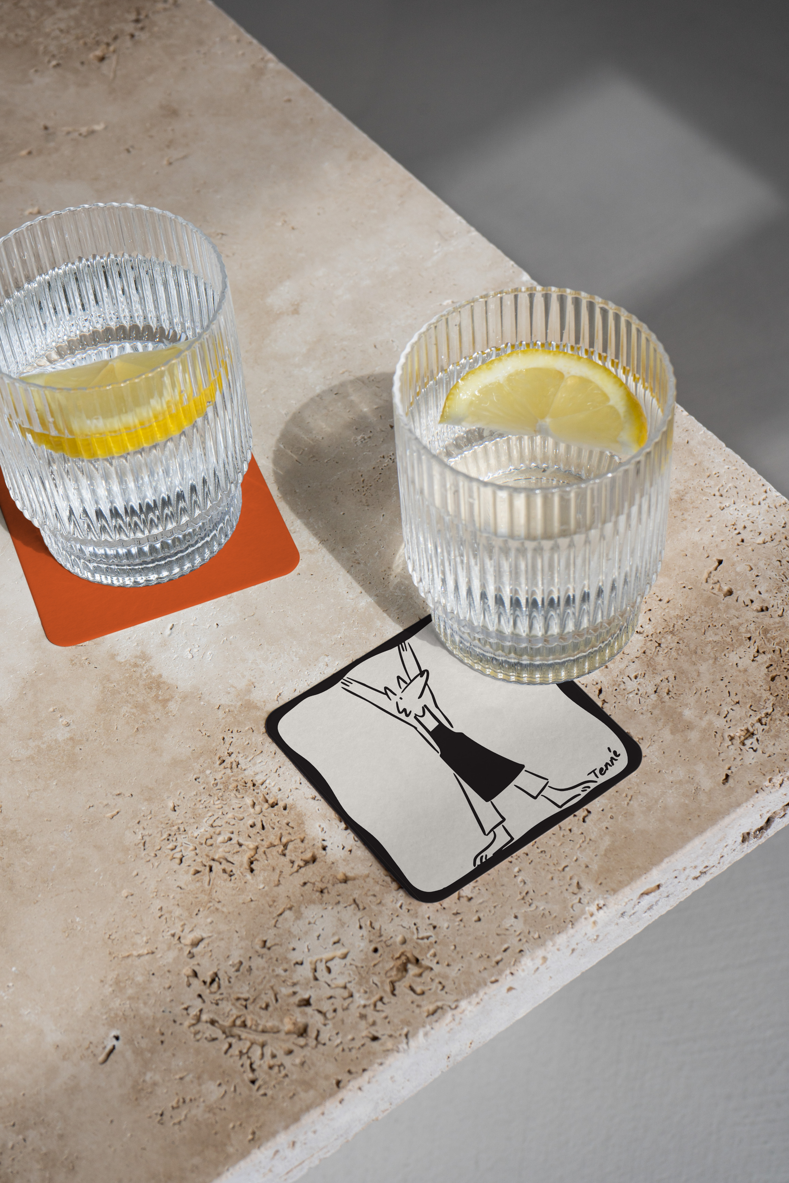
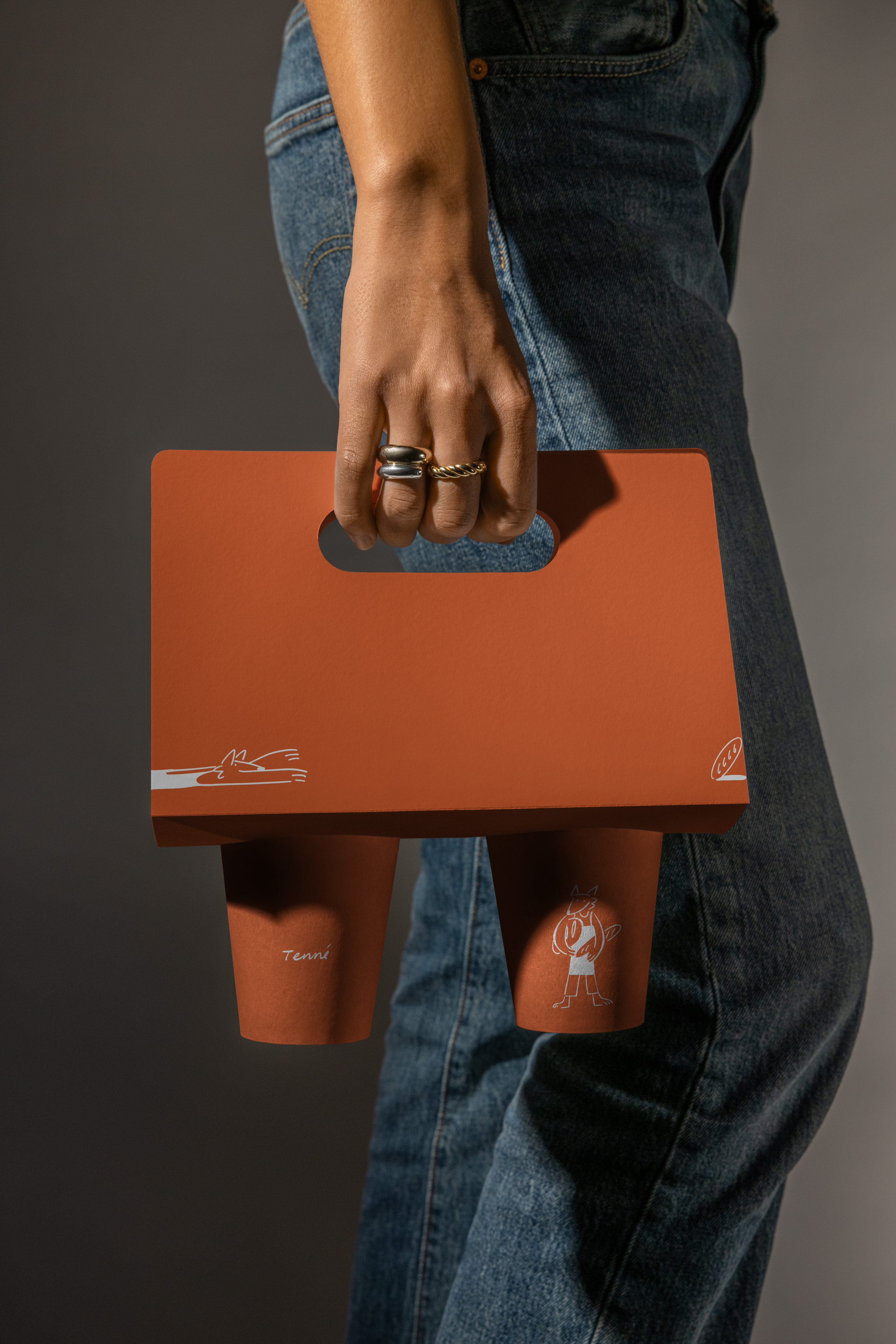
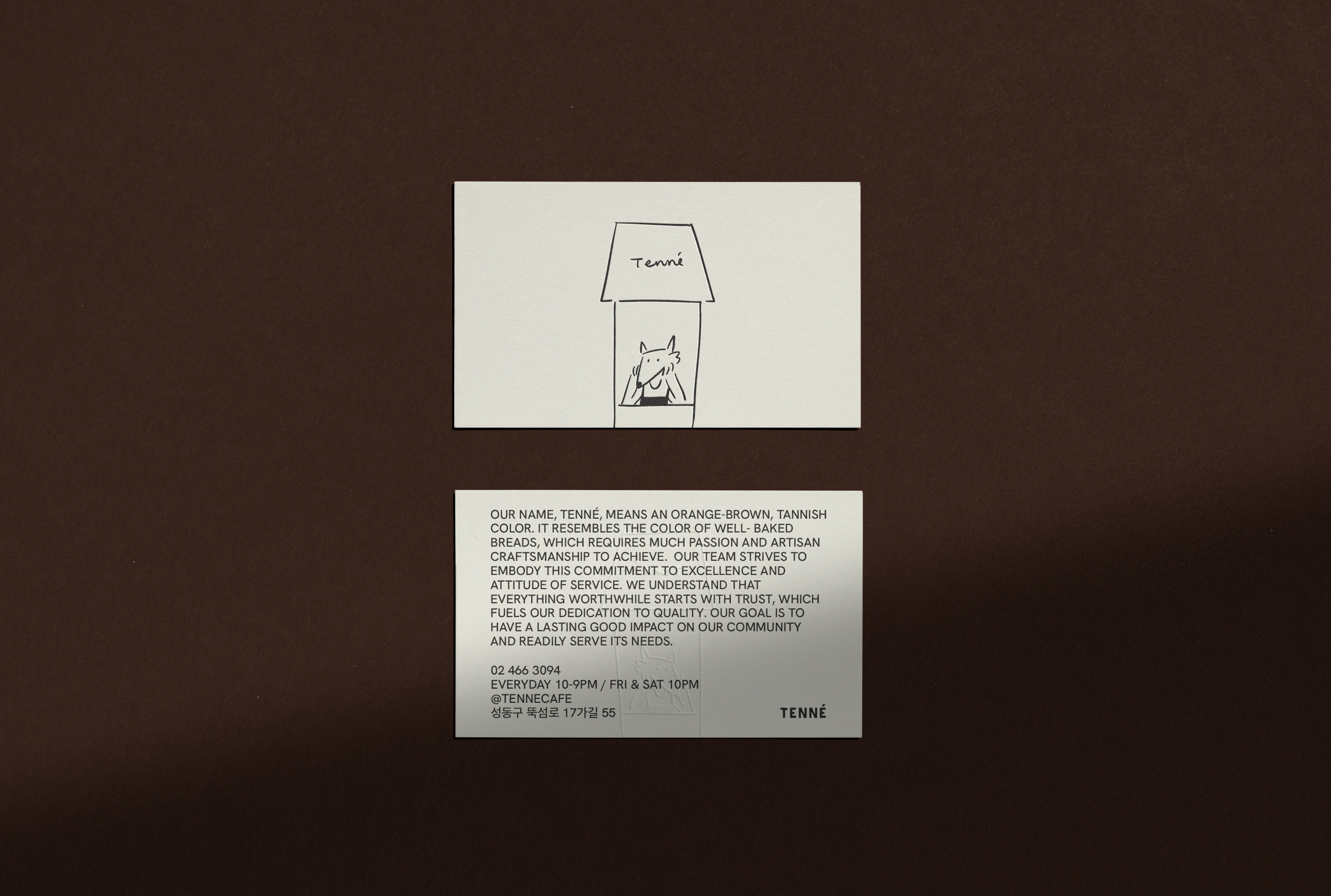
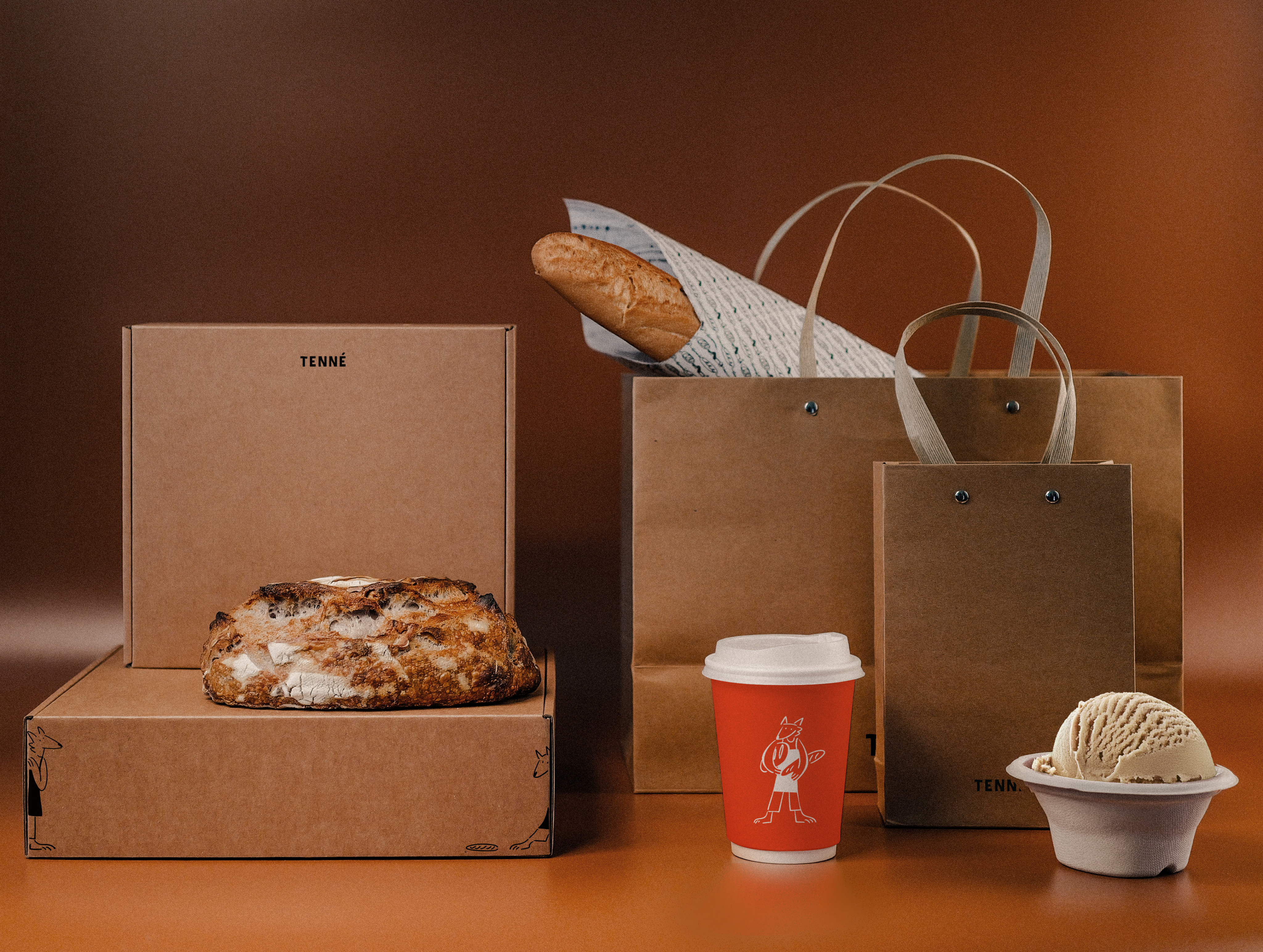
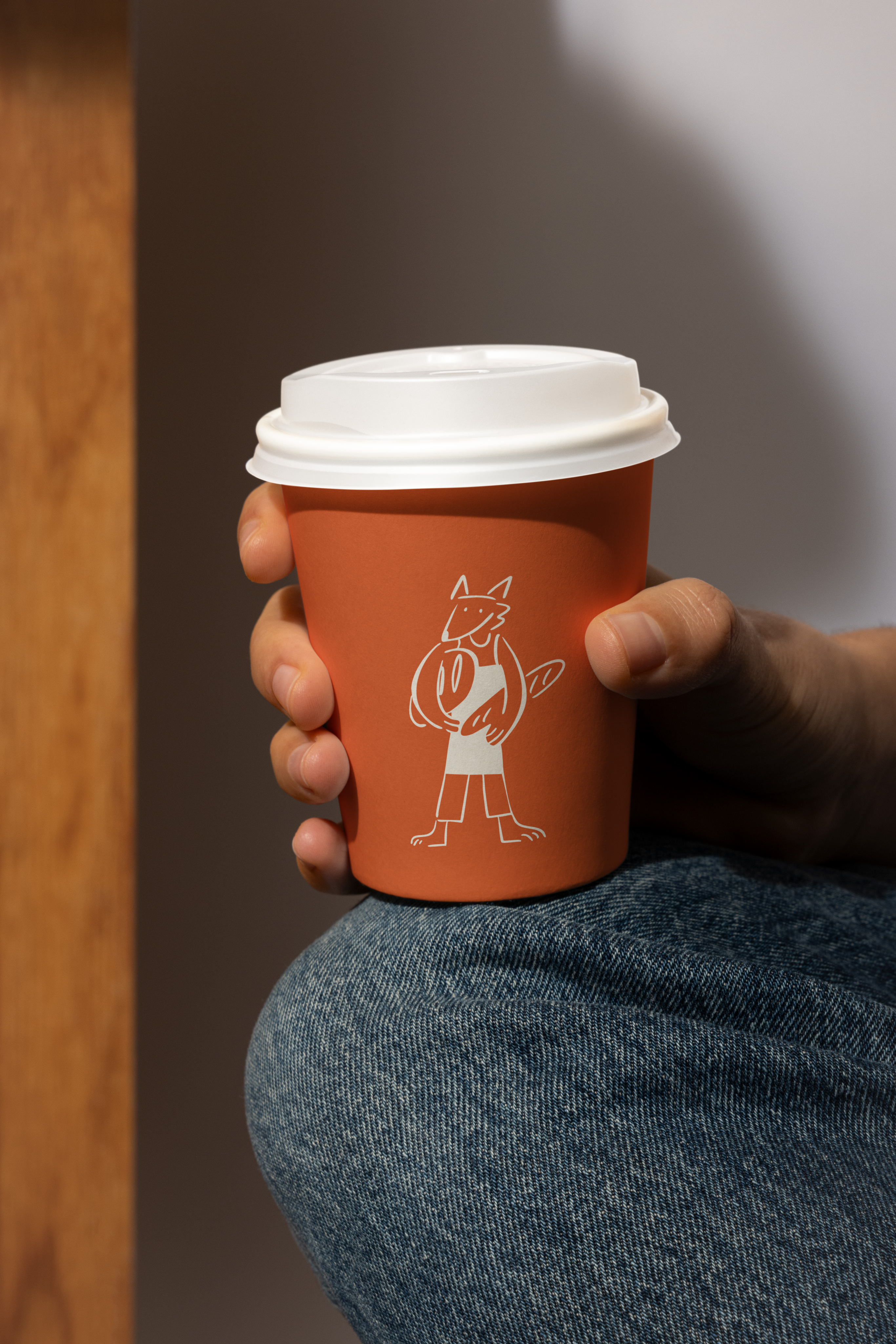
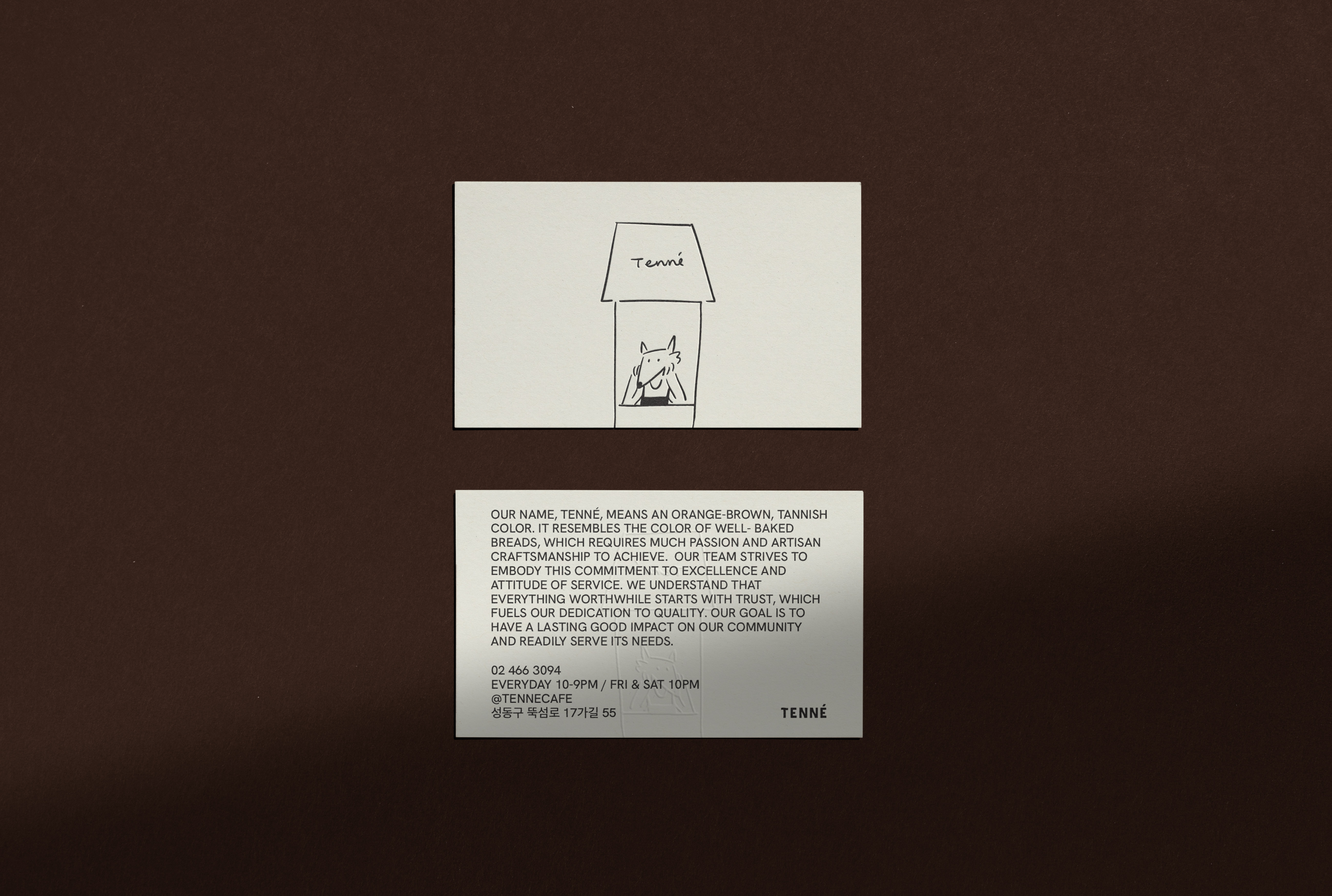
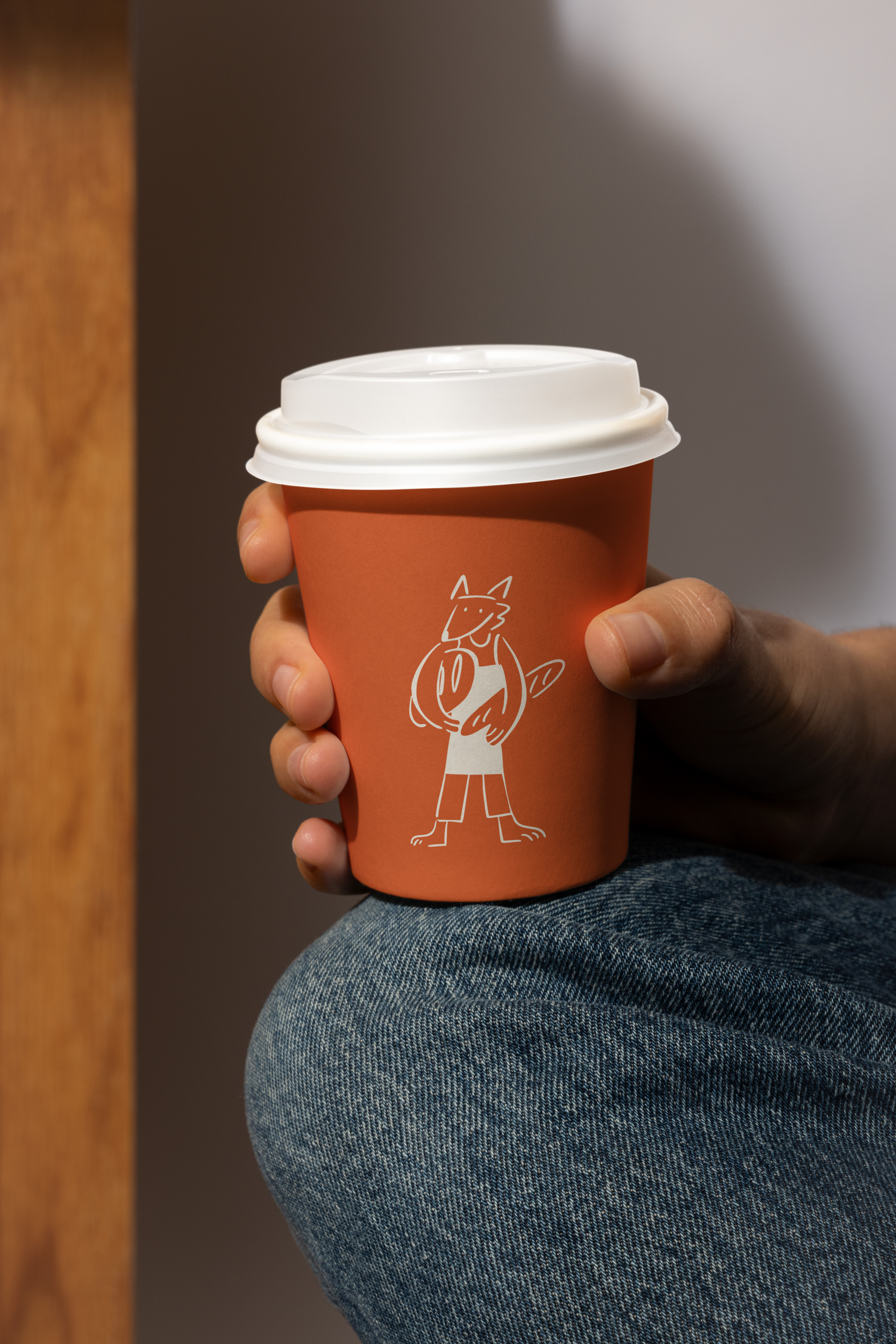
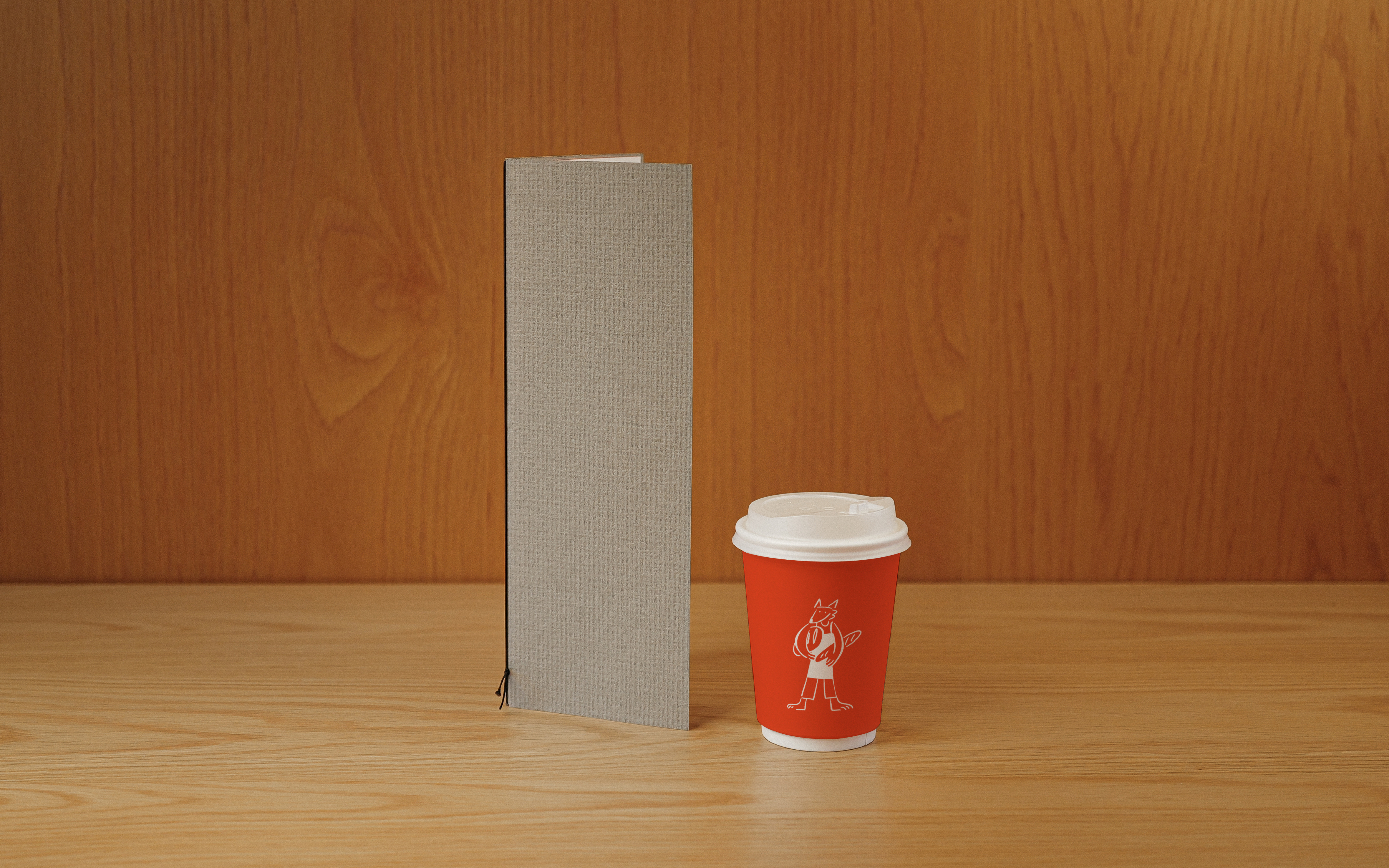
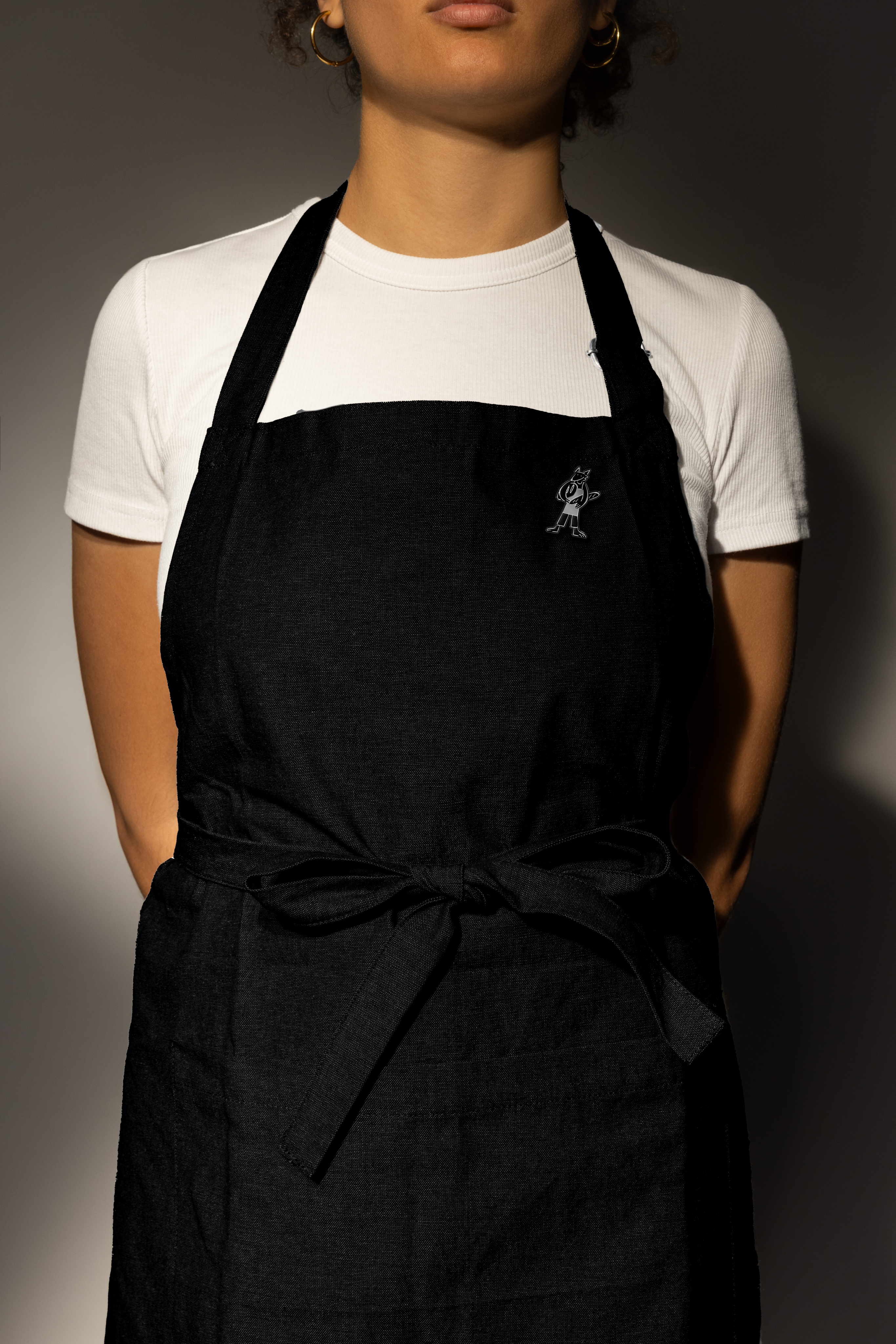
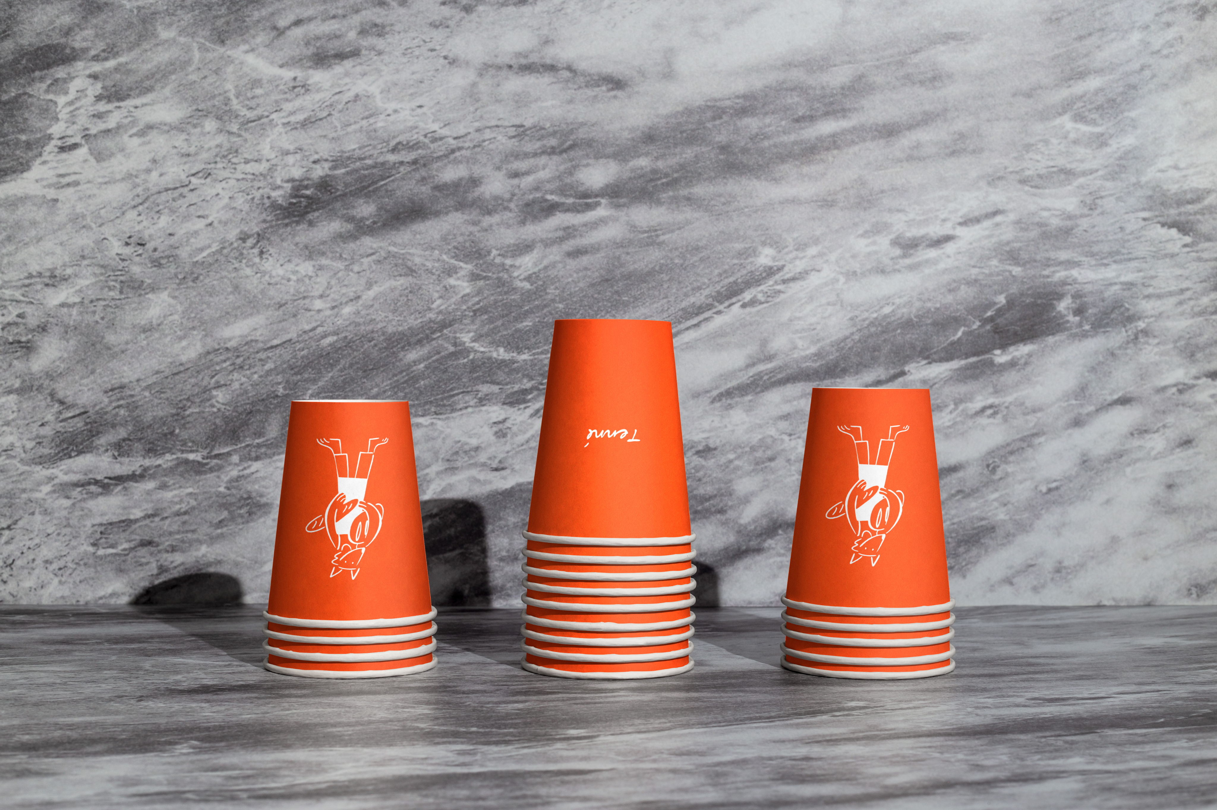
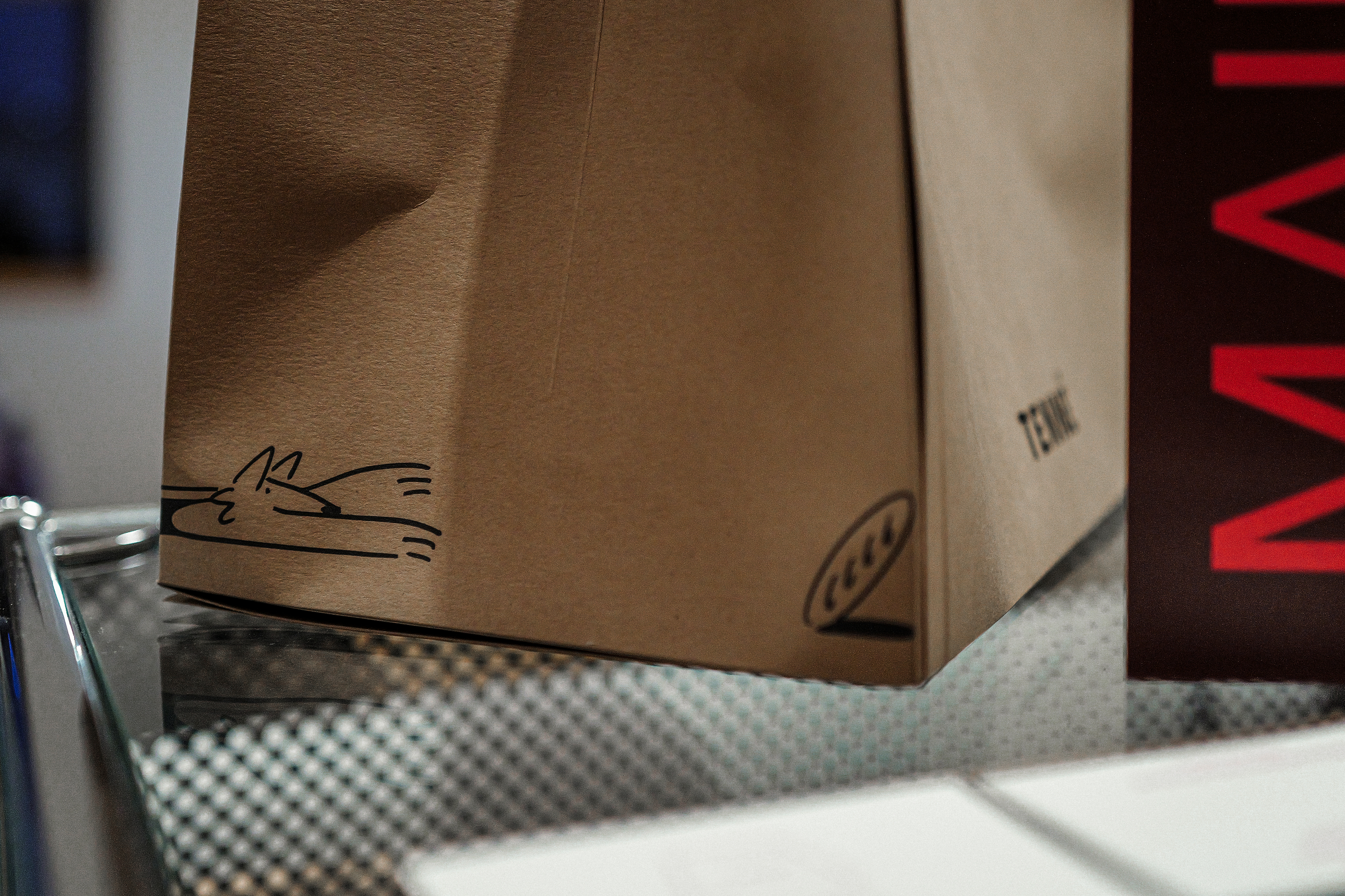
일러스트레이션은 공간 곳곳에 은은히 숨겨져 있어, 고객이 ‘설명’이 아니라 ‘발견’을 통해 브랜드를 느낄 수 있도록 했습니다.
강요되는 것은 없고, 모든 것은 ‘느껴지는 것’.
보이기보다 먼저 ‘감지되는 브랜드’.
소음의 시장 속에서, Tenné는 숨을 쉬는 브랜드입니다.
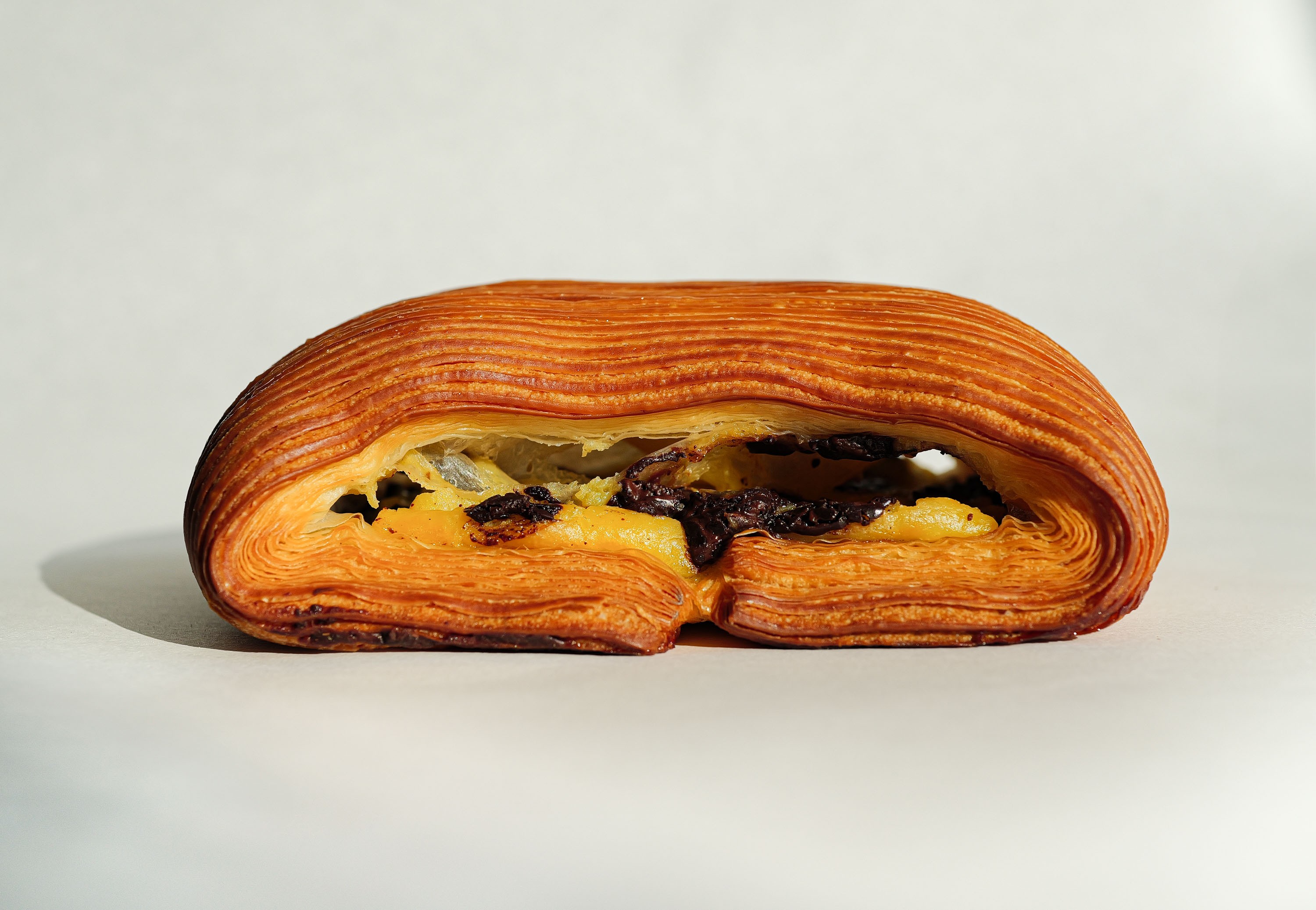
In an era where every bakery claims “quality,” “taste,” and “ambience,” TIN explored a quieter path. Tenné emerged as a brand built on the aesthetics of emptiness, an exercise in restraint from space to identity to communication. At its core lies Tenné, a fictional and unseen character who protects warmth, bread, and love, existing only through whispers.
TIN approached the project not as a bakery brand, but as an immersive emotional ecosystem. The challenge wasn’t to decorate, but to subtract, to let the audience find the brand rather than be shown it.
Through this process, TIN defined its own theory: Quiet Branding, where design, space, and story harmonize without noise. From spatial layout to tone of voice, every choice was made to preserve clarity and calm.
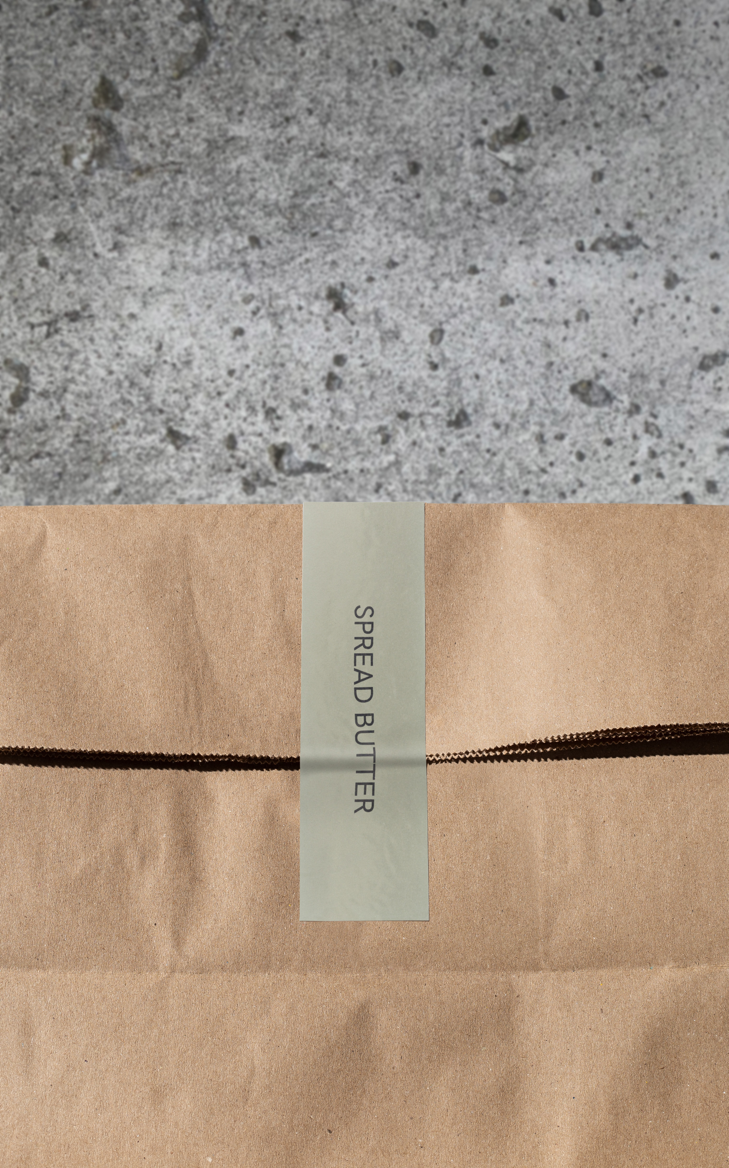
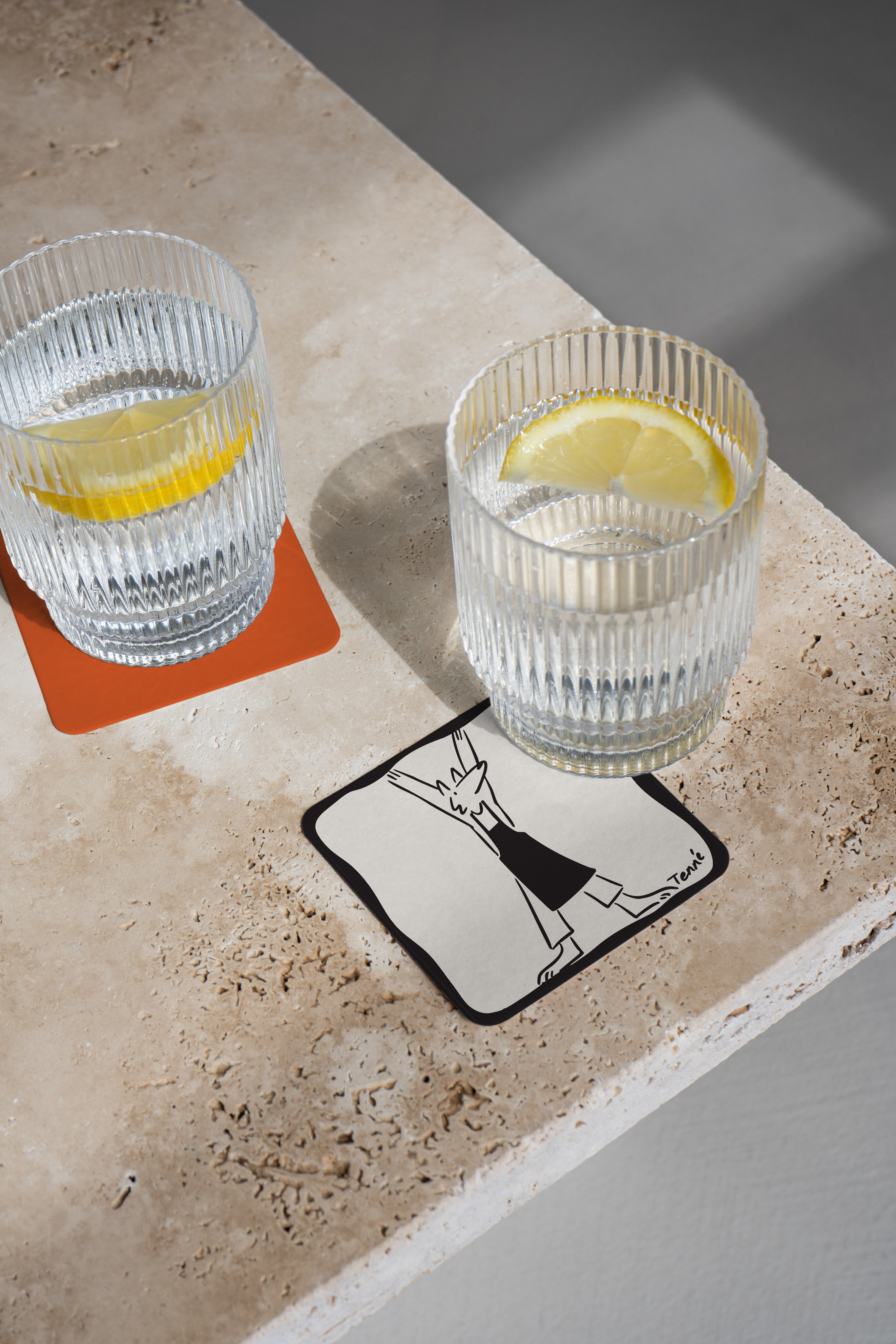
Illustrations of Tenné were subtly hidden throughout the space, inviting visitors to discover rather than be told. Nothing was forced; everything was felt.
In a market full of noise, Tenné is a brand that breathes.
What we did
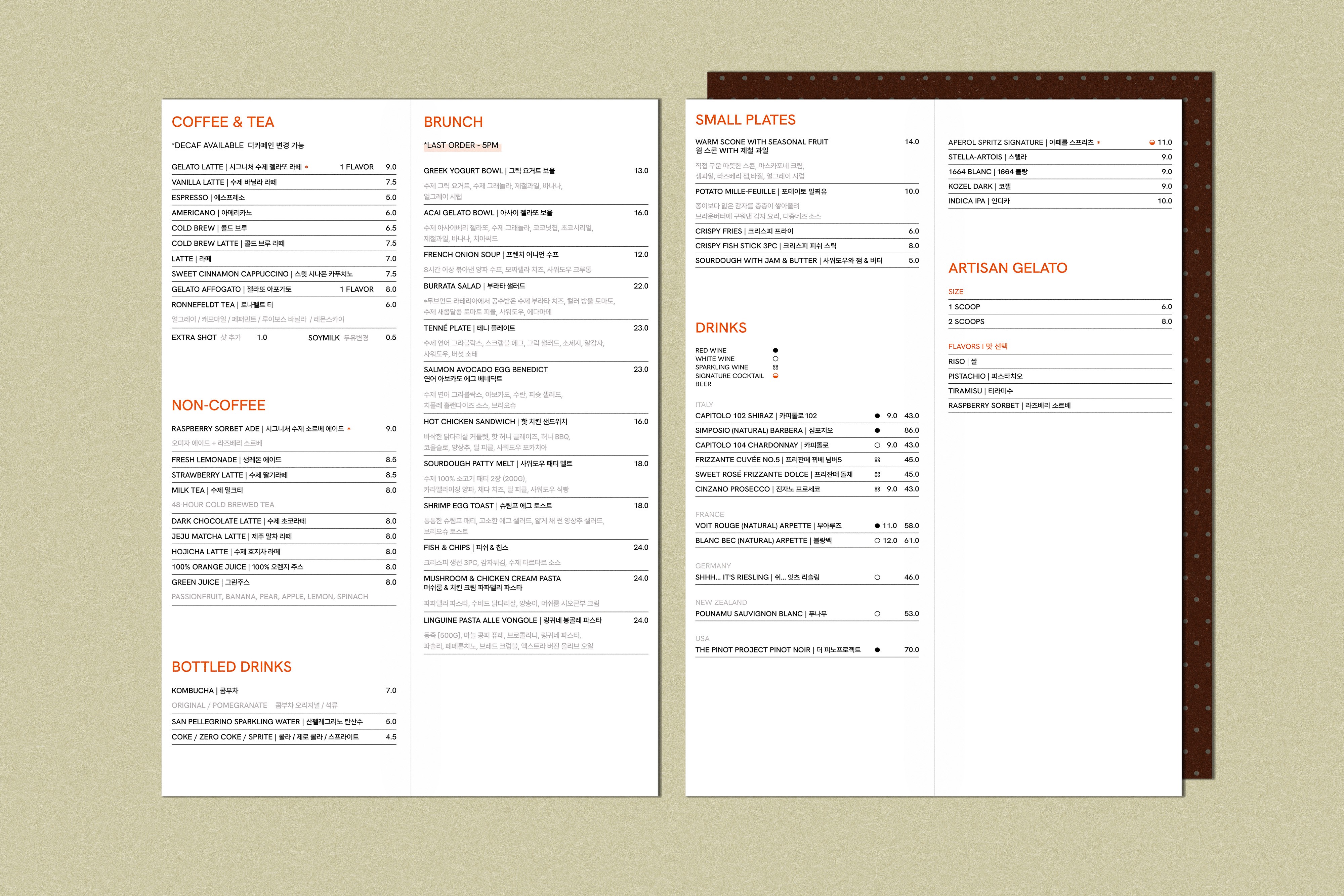
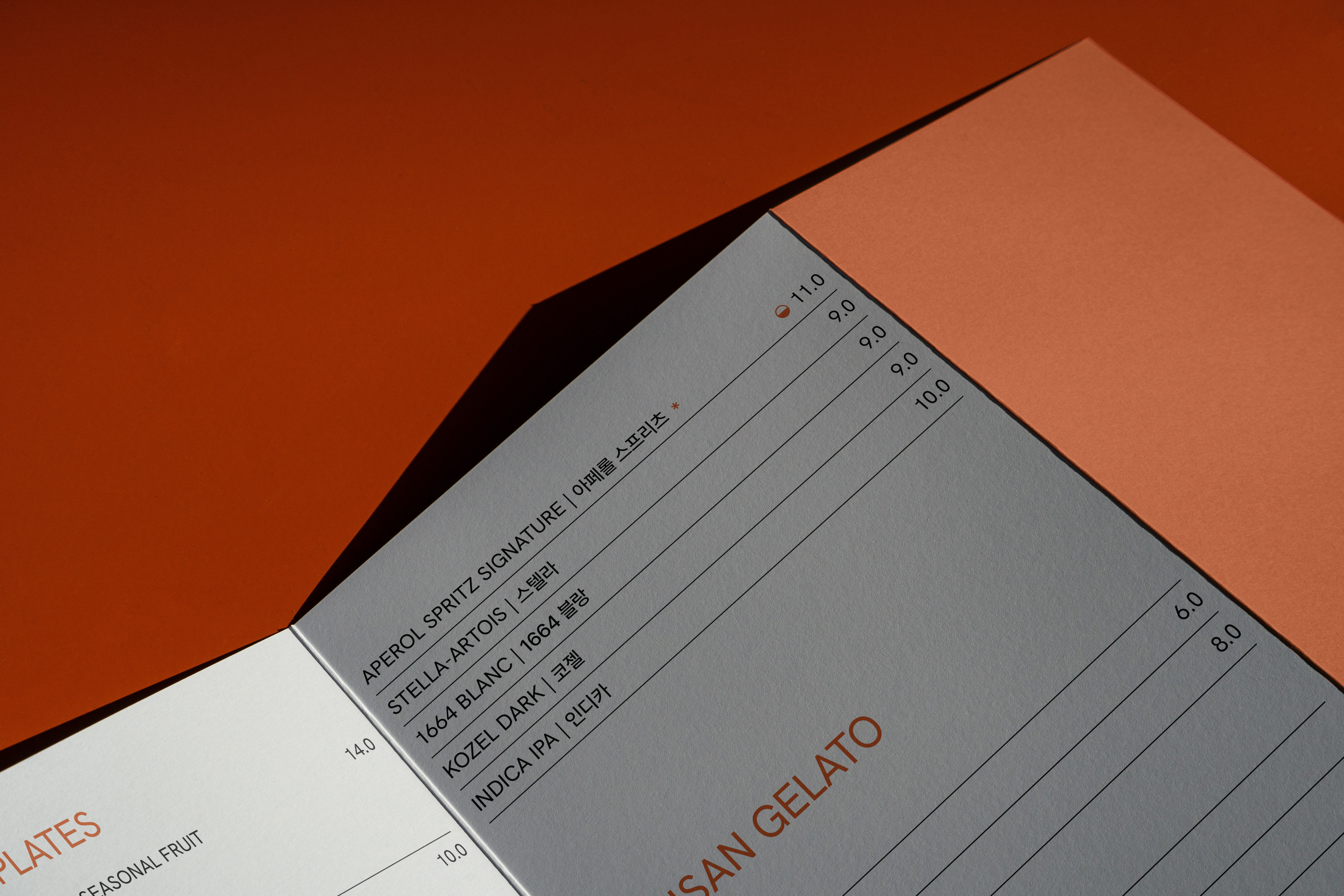
브랜드 전략, 브랜드 아이덴티티, 아트 디렉션, 카피라이팅, 패키지 디자인, 캠페인, 디지털 전략, 소셜 미디어 콘텐츠, 사진, 인쇄물 디자인, 사이니지, 유니폼 및 머천다이즈 디자인
Brand Strategy, Brand Identity, Art Direction, Copywriting, Packaging, Campaign, Digital Strategy, Social Media Content, Photography, Printed Matter, Signage Design, Uniform & Merchandise Design
Project Site
↗
프로젝트 상담
↗


About this project
Tenné — 숨쉬는 브랜드
모든 베이커리가 ‘품질’, ‘맛’, ‘분위기’를 이야기하는 시대 속에서, TIN은 더 조용한 길을 택했습니다. Tenné는 ‘비움의 미학’ 위에 세워진 브랜드로, 공간부터 아이덴티티, 커뮤니케이션에 이르기까지 절제의 실험이었습니다. 그 중심에는 따뜻함과 빵, 사랑을 지켜주는 보이지 않는 존재 ‘Tenné’ 가 있습니다.
‘브랜드는 어떻게 침묵 속에서도 존재감을 가질 수 있을까?’ TIN은 이 프로젝트를 장식하는 대신 덜어내고, 보여주는 대신 발견하게 했습니다.
그 과정에서 TIN은 ‘Quiet Branding’ 이라는 이론을 세웠습니다. 디자인, 공간, 이야기의 모든 요소가 소음 없이 조화를 이루도록, 모든 선택은 명료함과 평온함을 지키는 방향으로 이루어졌습니다.
일러스트레이션은 공간 곳곳에 은은히 숨겨져 있어, 고객이 ‘설명’이 아니라 ‘발견’을 통해 브랜드를 느낄 수 있도록 했습니다.
강요되는 것은 없고, 모든 것은 ‘느껴지는 것’.
보이기보다 먼저 ‘감지되는 브랜드’.
소음의 시장 속에서, Tenné는 숨을 쉬는 브랜드입니다.
In an era where every bakery claims “quality,” “taste,” and “ambience,” TIN explored a quieter path. Tenné emerged as a brand built on the aesthetics of emptiness, an exercise in restraint from space to identity to communication. At its core lies Tenné, a fictional and unseen character who protects warmth, bread, and love, existing only through whispers.
TIN approached the project not as a bakery brand, but as an immersive emotional ecosystem. The challenge wasn’t to decorate, but to subtract, to let the audience find the brand rather than be shown it.
Through this process, TIN defined its own theory: Quiet Branding, where design, space, and story harmonize without noise. From spatial layout to tone of voice, every choice was made to preserve clarity and calm.
Illustrations of Tenné were subtly hidden throughout the space, inviting visitors to discover rather than be told. Nothing was forced; everything was felt.
In a market full of noise, Tenné is a brand that breathes.
What we did
브랜드 전략, 브랜드 아이덴티티, 아트 디렉션, 카피라이팅, 패키지 디자인, 캠페인, 디지털 전략, 소셜 미디어 콘텐츠, 사진, 인쇄물 디자인, 사이니지, 유니폼 및 머천다이즈 디자인
Brand Strategy, Brand Identity, Art Direction, Copywriting, Packaging, Campaign, Digital Strategy, Social Media Content, Photography, Printed Matter, Signage Design, Uniform & Merchandise Design
Project Site
↗
프로젝트 상담
↗